radio、checkbox和switch应该是一个比较常用的html标签,尤其是在中后台ERP系统里面更为常见。不过浏览器自带的样式不怎么好看,而且不同浏览器效果也不一样。出于美化和统一视觉效果的需求,自定义样式就被提出来了。
实现思路
纯css实现的主要手段是利用label标签的模拟功能。label的for属性可以关联一个具体的input元素,即使这个input本身不可被用户可见,有个与它对应的label后,用户可以直接通过和label标签交互来替代原生的input——而这给我们的样式模拟留下了空间。简而言之就是:
隐藏原生input,样式定义的过程留给label (那为什么不直接改变checkbox的样式?因为checkbox作为浏览器默认组件,样式更改上并没有label那么方便,很多属性对checkbox都是不起作用的,比如background,而label在样式上基本和div一样'任人宰割')
而在选择事件上,由于css的“相邻选择符(E+F)”的存在,让我们可以直接利用html的默认checkbox,免去了js模拟选择的麻烦。
准备知识
DEMO的部分CSS3属性只写了webkit前缀,所以建议用webkit内核的浏览器查看本页案例,当然只要你给样式补上对应的浏览器前缀,就可以实现更多样式匹配
HTML代码:
| <!-- input的id必须有,这个是label进行元素匹配所必需的 --> | |
| <!-- 可以看到每个input的id和label的“for”属性对应同一字符串 --> | |
| <input type="checkbox" id="checkbox01" /> | |
| <label for="checkbox01"></label> | |
| <input type="checkbox" id="checkbox02" /> | |
| <label for="checkbox02"></label> | |
| <input type="checkbox" id="checkbox03" /> | |
| <label for="checkbox03"></label> | |
| <input type="checkbox" id="checkbox04" /> | |
| <label for="checkbox04"></label> |
HTML构建完成,接下来是对应的css:
| /* 隐藏所有checkbox */ | |
| input[type='checkbox'] { | |
| display: none; | |
| } | |
| /* 对label进行模拟.背景图片随便拼凑的,不要吐槽品味*/ | |
| /* transition效果是做个背景切换效果,这里单纯演示而已,实际上这个过渡不加更自然*/ | |
| label { | |
| display: inline-block; | |
| width: 60px; | |
| height: 60px; | |
| position: relative; | |
| background: url(//www.chitanda.me/images/blank.png); | |
| background-position: 0 0px; | |
| -webkit-transition: background 0.5s linear; | |
| } | |
| /* 利用相邻选择符和checkbox`:checked`的状态伪类来模拟默认选中效果(就是点击后那个勾号的效果) */ | |
| /*如果这段代码注释,点击后将没有任何反馈给用户*/ | |
| /*因为label本身是没有点击后被选中的状态的,checkbox被隐藏后,这个状态只能手动模拟*/ | |
| input[type='checkbox']:checked+label { | |
| background-position: 0 -60px; | |
| } |
上面代码看起来好像也可以了。不过仔细想想,貌似缺了点什么:选项对应的提示文字
对css不了解的新人可能这时候第一反应就是在label后面用p标签或者span标签来添加文字。不过这种方式都不怎么优雅。个人建议用css的::before和::after伪元素(::before和:before是一个东西。不过为了把“伪元素”和“伪类”区分出来,W3C建议的写法是伪元素用::而伪类用:)
| /* 伪元素的生效很简单,定义`content`就好,其余的属性和普通div一样 */ | |
| label::after { | |
| content: attr(data-name); | |
| /*利用attr可以减少css代码量,data-name写在html部分的label属性里*/ | |
| display: inline-block; | |
| position: relative; | |
| width: 120px; | |
| height: 60px; | |
| left: 100%; | |
| vertical-align: middle; | |
| margin: 10px; | |
| } |
当然既然可以用::after模拟label的文字,那也就可以用::before模拟label的checkbox样式,这里就不做解析了。
这里提一下伪类和伪元素的区分:
1)伪类:存在的意义是为了通过选择器找到那些不存在于DOM树中的信息以及不能被常规CSS选择器获取到的信息。 伪类由一个冒号:开头,冒号后面是伪类的名称和包含在圆括号中的可选参数。
常用的伪类:
| :active 向被激活的元素添加样式。 | |
| :focus 向拥有键盘输入焦点的元素添加样式。 | |
| :hover 当鼠标悬浮在元素上方时,向元素添加样式。 | |
| :link 向未被访问的链接添加样式。 | |
| :visited 向已被访问的链接添加样式。 | |
| :first-child 向元素的第一个子元素添加样式。 | |
| :checked 向选中的控件元素添加样式 |
2)伪元素:伪元素在DOM树中创建了一些抽象元素,这些抽象元素是不存在于文档语言里的(可以理解为html源码);
注意: css3为了区分伪类和伪元素,规定伪类前面有一个冒号,伪元素前面有两个冒号
常用伪元素:
关于伪元素的讲解,可以参考CSS伪类与伪元素总是傻傻分不清,这份总结够面试用了
| ::before 为作用元素的第一个子节点插入dom中 | |
| ::after 为作用元素的最后一个子节点插入dom中 |
- 同:都是通过选择器为元素添加样式
- 异:伪元素会创建一个元素,但不是真正的Html元素,伪类相当于为一个元素创建一个class样式
实例
自定义radio
html代码:
| <input type="radio" id="radio"> | |
| <label for="radio"></label> |
css代码:
| input{ | |
| display:none; | |
| } | |
| label { | |
| display: inline-block; | |
| width: 30px; | |
| height: 30px; | |
| border: 1px solid #333; | |
| border-radius: 50%; | |
| position: relative; | |
| } | |
| label::after { | |
| -webkit-transition: all .5s ease; | |
| -moz-transition: all .5s ease; | |
| -o-transition: all .5s ease; | |
| -ms-transition: all .5s ease; | |
| transition: all .5s ease; | |
| cursor: pointer; | |
| position: absolute; | |
| width: 16px; | |
| height: 16px; | |
| border-radius: 50%; | |
| top: 50%; | |
| left: 50%; | |
| margin-top:-8px; | |
| margin-left:-8px; | |
| z-index: 1; | |
| content: ''; | |
| border:1px solid #333; | |
| } | |
| input:checked+label::after{ | |
| background:red; | |
| } |
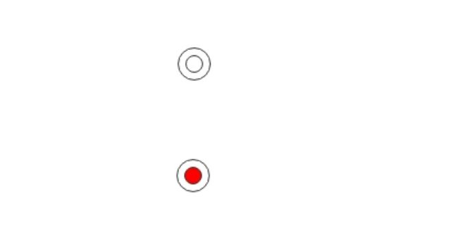
实现效果:
点击前和点击后:
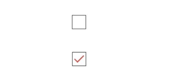
自定义checkbox
漂亮的checkbox长这样的,看着就很可爱
我们可以不追求那么完美的样式,可以实现下面简单好看的样式就可以
html代码:
| <input type="checkbox" id="checkbox"> | |
| <label for="checkbox"></label> |
css代码:
| input{ | |
| display:none; | |
| } | |
| label { | |
| display: inline-block; | |
| width: 30px; | |
| height: 30px; | |
| border: 1px solid #333; | |
| position: relative; | |
| } | |
| label::after { | |
| -webkit-transition: opacity .5s ease; | |
| -moz-transition: opacity .5s ease; | |
| -o-transition: opacity .5s ease; | |
| -ms-transition: opacity .5s ease; | |
| transition: opacity .5s ease; | |
| cursor: pointer; | |
| position: absolute; | |
| content: ''; | |
| opacity: 0; | |
| } | |
| input:checked+label::after{ | |
| border: 2px solid #d73d32; | |
| border-top: none; | |
| border-right: none; | |
| -webkit-transform: rotate(-45deg); | |
| -ms-transform: rotate(-45deg); | |
| transform: rotate(-45deg); | |
| width:20px; | |
| height:10px; | |
| top:50%; | |
| margin-top:-8px; | |
| left:50%; | |
| margin-left:-10px; | |
| opacity: 1.0; | |
| } |
实现效果:
点击前和点击后:
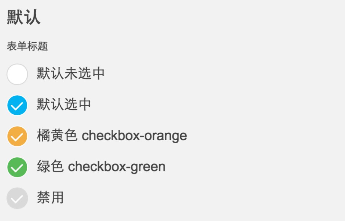
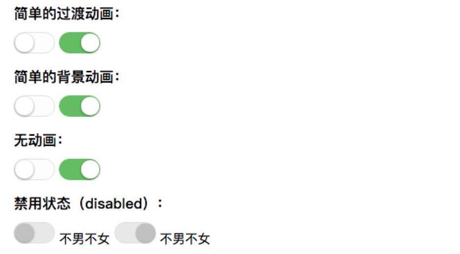
自定义switch
继续分享一个iOS风格的switch开关按钮,样子也非常常见,如图:
主要是使用了<input ?type="checkbox">来模拟实现,具体的HTML:
html 代码:
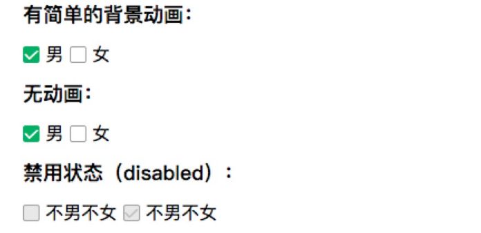
| <label><input class="mui-switch" type="checkbox"> 默认未选中</label> | |
| <label><input class="mui-switch" type="checkbox" checked> 默认选中</label> | |
| <label><input class="mui-switch mui-switch-animbg" type="checkbox"> 默认未选中,简单的背景过渡效果,加mui-switch-animbg类即可</label> | |
| <label><input class="mui-switch mui-switch-animbg" type="checkbox" checked> 默认选中</label> | |
| <label><input class="mui-switch mui-switch-anim" type="checkbox"> 默认未选中,过渡效果,加 mui-switch-anim | |
| 类即可</label> | |
| <label><input class="mui-switch mui-switch-anim" type="checkbox" checked> 默认选中</label> |
在实际的使用中后来又增加了两个过渡效果,分别加?mui-switch-animbg和mui-switch-anim?类即可,具体效果查看下面的demo页面。
CSS代码(SCSS导出的,排版有些奇怪):
css 代码:
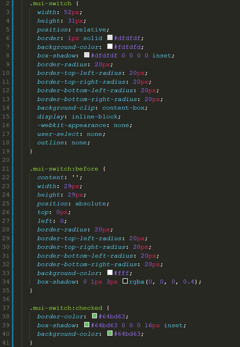
剩下部分
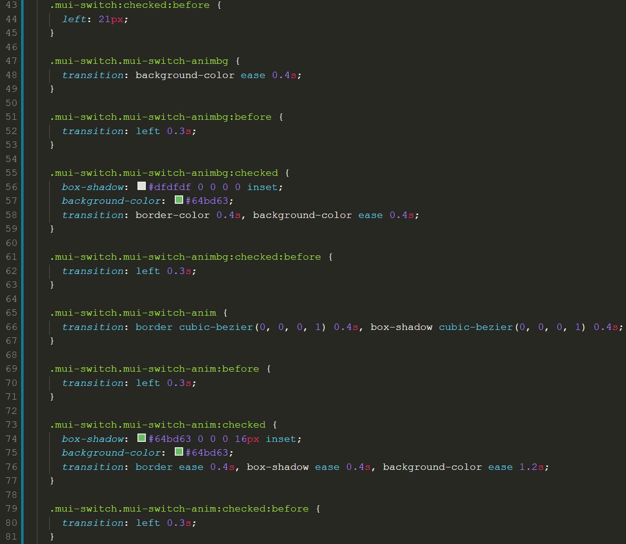
这里给出具体的css,方便大家复制本地实现
| <style> | |
| .mui-switch { | |
| width: 52px; | |
| height: 31px; | |
| position: relative; | |
| border: 1px solid #dfdfdf; | |
| background-color: #fdfdfd; | |
| box-shadow: #dfdfdf 0 0 0 0 inset; | |
| border-radius: 20px; | |
| border-top-left-radius: 20px; | |
| border-top-right-radius: 20px; | |
| border-bottom-left-radius: 20px; | |
| border-bottom-right-radius: 20px; | |
| background-clip: content-box; | |
| display: inline-block; | |
| -webkit-appearance: none; | |
| user-select: none; | |
| outline: none; | |
| } | |
| .mui-switch:before { | |
| content: ''; | |
| width: 29px; | |
| height: 29px; | |
| position: absolute; | |
| top: 0px; | |
| left: 0; | |
| border-radius: 20px; | |
| border-top-left-radius: 20px; | |
| border-top-right-radius: 20px; | |
| border-bottom-left-radius: 20px; | |
| border-bottom-right-radius: 20px; | |
| background-color: #fff; | |
| box-shadow: 0 1px 3px rgba(0, 0, 0, 0.4); | |
| } | |
| .mui-switch:checked { | |
| border-color: #64bd63; | |
| box-shadow: #64bd63 0 0 0 16px inset; | |
| background-color: #64bd63; | |
| } | |
| .mui-switch:checked:before { | |
| left: 21px; | |
| } | |
| .mui-switch.mui-switch-animbg { | |
| transition: background-color ease 0.4s; | |
| } | |
| .mui-switch.mui-switch-animbg:before { | |
| transition: left 0.3s; | |
| } | |
| .mui-switch.mui-switch-animbg:checked { | |
| box-shadow: #dfdfdf 0 0 0 0 inset; | |
| background-color: #64bd63; | |
| transition: border-color 0.4s, background-color ease 0.4s; | |
| } | |
| .mui-switch.mui-switch-animbg:checked:before { | |
| transition: left 0.3s; | |
| } | |
| .mui-switch.mui-switch-anim { | |
| transition: border cubic-bezier(0, 0, 0, 1) 0.4s, box-shadow cubic-bezier(0, 0, 0, 1) 0.4s; | |
| } | |
| .mui-switch.mui-switch-anim:before { | |
| transition: left 0.3s; | |
| } | |
| .mui-switch.mui-switch-anim:checked { | |
| box-shadow: #64bd63 0 0 0 16px inset; | |
| background-color: #64bd63; | |
| transition: border ease 0.4s, box-shadow ease 0.4s, background-color ease 1.2s; | |
| } | |
| .mui-switch.mui-switch-anim:checked:before { | |
| transition: left 0.3s; | |
| } | |
| /*# sourceMappingURL=mui-switch.css.map */ | |
| </style> |
如果你喜欢scss,那么代码更加简洁
| @mixin borderRadius($radius:20px) { | |
| border-radius: $radius; | |
| border-top-left-radius: $radius; | |
| border-top-right-radius: $radius; | |
| border-bottom-left-radius: $radius; | |
| border-bottom-right-radius: $radius; | |
| } | |
| $duration: .4s; | |
| $checkedColor: #64bd63; | |
| .mui-switch { | |
| width: 52px; | |
| height: 31px; | |
| position: relative; | |
| border: 1px solid #dfdfdf; | |
| background-color: #fdfdfd; | |
| box-shadow: #dfdfdf 0 0 0 0 inset; | |
| @include borderRadius(); | |
| background-clip: content-box; | |
| display: inline-block; | |
| -webkit-appearance: none; | |
| user-select: none; | |
| outline: none; | |
| &:before { | |
| content: ''; | |
| width: 29px; | |
| height: 29px; | |
| position: absolute; | |
| top: 0px; | |
| left: 0; | |
| @include borderRadius(); | |
| background-color: #fff; | |
| box-shadow: 0 1px 3px rgba(0, 0, 0, 0.4); | |
| } | |
| &:checked { | |
| border-color: $checkedColor; | |
| box-shadow: $checkedColor 0 0 0 16px inset; | |
| background-color: $checkedColor; | |
| &:before { | |
| left: 21px; | |
| } | |
| } | |
| &.mui-switch-animbg { | |
| transition: background-color ease $duration; | |
| &:before { | |
| transition: left 0.3s; | |
| } | |
| &:checked { | |
| box-shadow: #dfdfdf 0 0 0 0 inset; | |
| background-color: $checkedColor; | |
| transition: border-color $duration, background-color ease $duration; | |
| &:before { | |
| transition: left 0.3s; | |
| } | |
| } | |
| } | |
| &.mui-switch-anim { | |
| transition: border cubic-bezier(0, 0, 0, 1) $duration, box-shadow cubic-bezier(0, 0, 0, 1) $duration; | |
| &:before { | |
| transition: left 0.3s; | |
| } | |
| &:checked { | |
| box-shadow: $checkedColor 0 0 0 16px inset; | |
| background-color: $checkedColor; | |
| transition: border ease $duration, box-shadow ease $duration, background-color ease $duration*3; | |
| &:before { | |
| transition: left 0.3s; | |
| } | |
| } | |
| } | |
| } |
链接文章
https://www.html.cn/archives/9274
https://segmentfault.com/a/1190000003711140