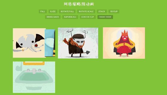
效果图
今天给大家带来的是 CSS3图片翻页动画(10种动画)!
丰富一下列位的特效储备库!
文件版源码获取,请看评论区!
废话不多说,上源码!
CSS源码:
| @import url(http://fonts.googleapis.com/css?family=Lato:400,700); | |
| @font-face { | |
| font-family: 'codropsicons'; | |
| src:url('../fonts/codropsicons/codropsicons.eot'); | |
| src:url('../fonts/codropsicons/codropsicons.eot?#iefix') format('embedded-opentype'), | |
| url('../fonts/codropsicons/codropsicons.woff') format('woff'), | |
| url('../fonts/codropsicons/codropsicons.ttf') format('truetype'), | |
| url('../fonts/codropsicons/codropsicons.svg#codropsicons') format('svg'); | |
| font-weight: normal; | |
| font-style: normal; | |
| } | |
| body { | |
| background: #81c439; | |
| color: #fff; | |
| font-family: 'Lato', Arial, sans-serif; | |
| } | |
| .clearfix:before, | |
| .clearfix:after { | |
| content: ''; | |
| display: table; | |
| } | |
| .clearfix:after { | |
| clear: both; | |
| } | |
| a { | |
| color: rgba(255,255,255,0.7); | |
| text-decoration: none; | |
| outline: none; | |
| } | |
| a:hover, | |
| a:focus { | |
| color: #fff | |
| } | |
| .container > header { | |
| margin: 0 auto; | |
| padding: 2em 15% 0; | |
| text-align: center; | |
| } | |
| .container > header h1 { | |
| font-size: 1.8em; | |
| line-height: 1.3; | |
| margin: 0; | |
| font-weight: 700; | |
| text-transform: uppercase; | |
| letter-spacing: 2px; | |
| word-spacing: 5px; | |
| } | |
| .container > header span { | |
| display: block; | |
| font-size: 60%; | |
| opacity: 0.7; | |
| padding: 0 0 0.6em 0.1em; | |
| } | |
| /* To Navigation Style */ | |
| .codrops-top { | |
| background: rgba(255, 255, 255, 0.1); | |
| text-transform: uppercase; | |
| width: 100%; | |
| font-size: 0.69em; | |
| line-height: 2.2; | |
| font-weight: 700; | |
| } | |
| .codrops-top a { | |
| text-decoration: none; | |
| padding: 0 1em; | |
| letter-spacing: 0.1em; | |
| display: inline-block; | |
| } | |
| .codrops-top a:hover { | |
| background: rgba(255,255,255,0.95); | |
| color: #81c439; | |
| } | |
| .codrops-top span.right { | |
| float: right; | |
| } | |
| .codrops-top span.right a { | |
| float: left; | |
| display: block; | |
| } | |
| .codrops-icon:before { | |
| font-family: 'codropsicons'; | |
| margin: 0 4px; | |
| speak: none; | |
| font-style: normal; | |
| font-weight: normal; | |
| font-variant: normal; | |
| text-transform: none; | |
| line-height: 1; | |
| -webkit-font-smoothing: antialiased; | |
| } | |
| .codrops-icon-drop:before { | |
| content: "\e001"; | |
| } | |
| .codrops-icon-prev:before { | |
| content: "\e004"; | |
| } | |
| /* Demo Buttons Style */ | |
| .codrops-demos { | |
| padding-top: 1em; | |
| max-width: 700px; | |
| margin: 0 auto; | |
| } | |
| .codrops-demos a { | |
| text-decoration: none; | |
| outline: none; | |
| display: inline-block; | |
| font-weight: 700; | |
| text-transform: uppercase; | |
| font-size: 0.8em; | |
| margin: 0.5em 0.4em; | |
| letter-spacing: 1px; | |
| background: rgba(0,0,0,0.1); | |
| padding: 0.4em 0.9em; | |
| -webkit-transition: all 0.2s; | |
| transition: all 0.2s; | |
| } | |
| .codrops-demos a.current-demo, | |
| .codrops-demos a:hover, | |
| .codrops-demos a:focus { | |
| opacity: 1; | |
| background: rgba(0,0,0,0.25); | |
| } | |
| section { | |
| text-align: center; | |
| font-size: 150%; | |
| padding: 1em 1% 2em; | |
| } | |
| @media screen and (max-width: 25em) { | |
| .codrops-icon span { | |
| display: none; | |
| } | |
| } | |
| index源码: | |
| <html> | |
| <head> | |
| <meta charset="UTF-8" /> | |
| <meta http-equiv="X-UA-Compatible" content="IE=edge,chrome=1"> | |
| <meta name="viewport" content="width=device-width, initial-scale=1.0"> | |
| <title>Animations for Thumbnail Grids | Demo 1</title> | |
| <link rel="stylesheet" type="text/css" href="css/normalize.css" /> | |
| <link rel="stylesheet" type="text/css" href="css/demo.css" /> | |
| <!--必要样式--> | |
| <link rel="stylesheet" type="text/css" href="css/component.css" /> | |
| <script src="js/modernizr.custom.js"></script> | |
| </head> | |
| <body> | |
| <div> | |
| <header> | |
| <h1>网格缩略图动画</h1> | |
| <nav> | |
| <a href="index.html">Fall</a> | |
| <a href="index2.html">Slide</a> | |
| <a href="index3.html">Rotate Fall</a> | |
| <a href="index4.html">Rotate Scale</a> | |
| <a href="index5.html">Stack</a> | |
| <a href="index6.html">3d Flip</a> | |
| <a href="index7.html">Bring back</a> | |
| <a href="index8.html">Superscale</a> | |
| <a href="index9.html">Center Flip</a> | |
| <a href="index10.html">Front Row</a> | |
| </nav> | |
| </header> | |
| <section> | |
| <ul class="tt-grid tt-effect-fall tt-effect-delay"> | |
| <li><a href="#"><img src="img/1.jpg" alt="img01"/></a></li> | |
| <li><a href="#"><img src="img/2.jpg" alt="img02"/></a></li> | |
| <li><a href="#"><img src="img/3.jpg" alt="img03"/></a></li> | |
| <li><a href="#"><img src="img/4.jpg" alt="img04"/></a></li> | |
| <li><a href="#"><img src="img/5.jpg" alt="img05"/></a></li> | |
| <li><a href="#"><img src="img/6.jpg" alt="img06"/></a></li> | |
| </ul> | |
| <nav> | |
| <a></a><a></a><a></a><a></a> | |
| </nav> | |
| </section> | |
| </div><!-- /container --> | |
| <script src="js/classie.js"></script> | |
| <script src="js/thumbnailGridEffects.js"></script> | |
| </body> | |
| </html> |