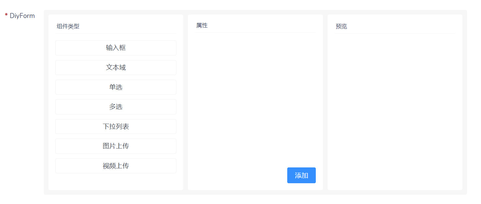
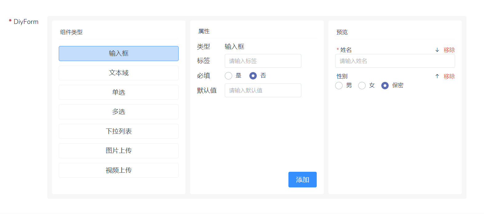
效果
功能
自定义组合表单项, 适用于需要自定义表单项的场景
安装
composer require slowlyo/dcat-diy-form
GitHub
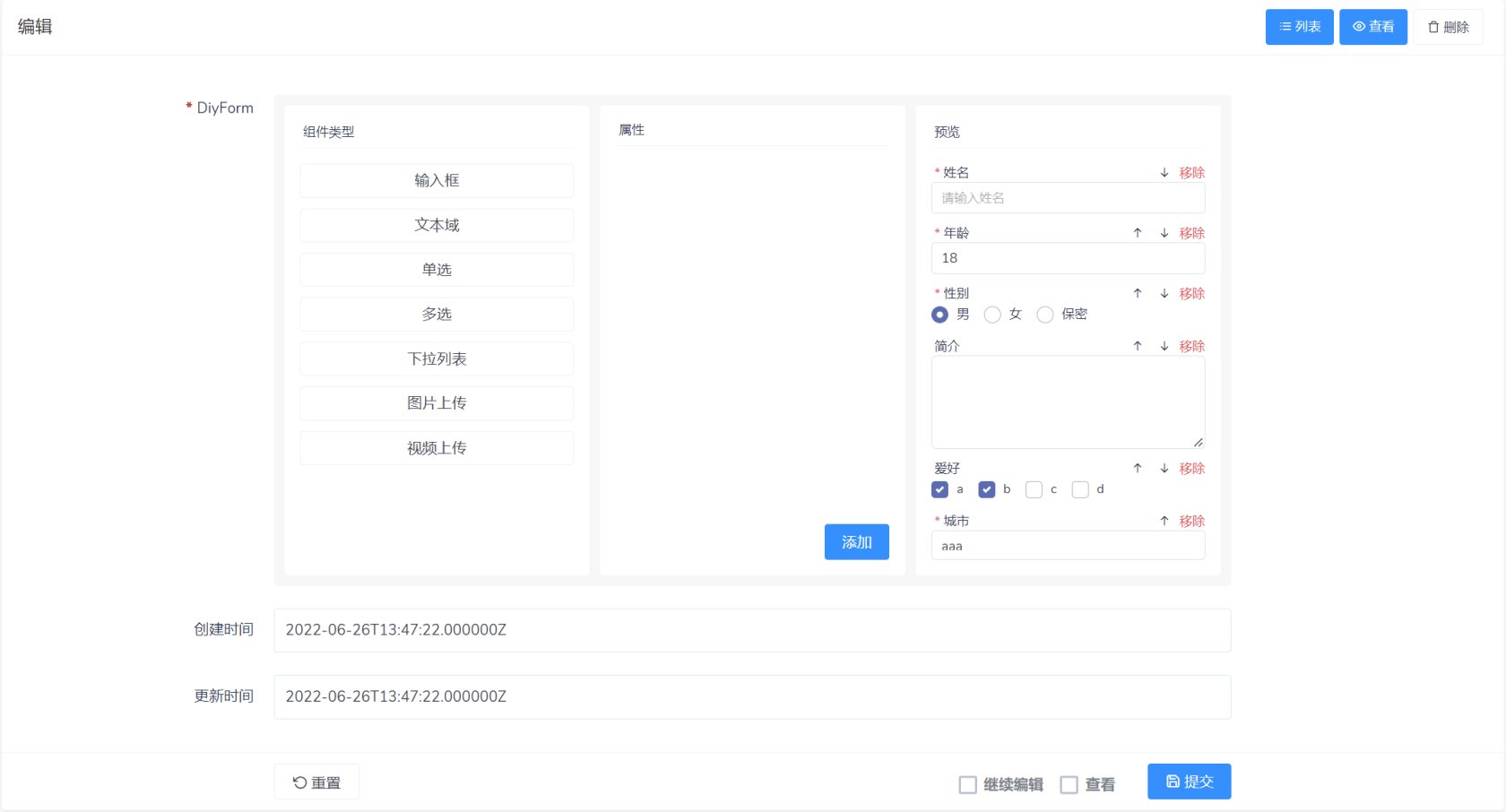
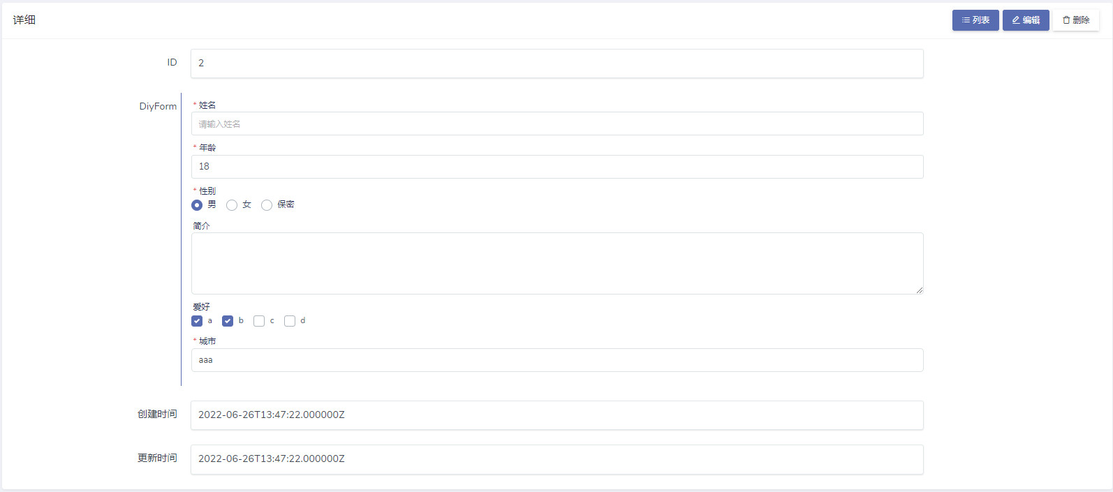
使用
| |
| $form->diyForm('field_name'); |
| |
| $show->field('filed_name')->diyForm(); |
扩展项
为了方便扩展, 组件中提供了一些方法
默认组件类型包括:
- input
- textarea
- radio
- checkbox
- select
- upload-image
- upload-vedio
themeColor()
| |
| |
| $form->diyForm('field_name')->themeColor('red'); |
subComponentType()
| |
| $form->diyForm('field_name')->subComponentType('textarea'); |
subComponentTypes()
| |
| $form->diyForm('field_name')->subComponentTypes(['textarea', 'input']); |
addComponentType()
| |
| $form->diyForm('name', 'DiyForm')->addComponentType([ |
| |
| 'name' => '文本域', |
| |
| 'type' => 'textarea', |
| |
| 'label' => '', |
| |
| 'required' => 0, |
| |
| 'props_items' => [ |
| |
| [ |
| |
| 'label' => '显示行', |
| |
| 'bind' => 'rows', |
| ], |
| ], |
| |
| 'default_value' => '', |
| |
| 'options' => [ |
| |
| 'label' => '选项', |
| |
| 'values' => [''], |
| ], |
| |
| 'rows' => 3, |
| |
| 'validate_handler' => \Dcat\Admin\Support\JavaScript::make(<<<JS |
| |
| (data) => { |
| |
| if(!data.rows){ |
| |
| return '请输入显示行' |
| } |
| |
| } |
| JS |
| |
| ), |
| ]); |
addComponentTypes()
| |
| $form->diyForm('field_name')->subComponentTypes([['自定义组件一的数据'], ['自定义组件二的数据'], ...]); |
addPreviewHtml()
| // addPreviewHtml() 方法可以添加一段html代码到预览卡片中, 用于自定义组件的显示 |
| $form->diyForm('field_name')->addPreviewHtml(<<<HTML |
| |
| <!-- 此处以radio为例, 基本这些类名都需要, 不然样式不统一 --> |
| <div class="preview-item" v-if="item.type == 'radio'" :class="'animate-item-' + index"> |
| |
| <label class="d-flex justify-content-between"> |
| |
| <div> |
| |
| <span class="text-danger" v-if="item.required == 1">* </span> |
| |
| @{{ item.label }} |
| </div> |
| |
| <div> |
| |
| <span class="move-item hover-line" |
| v-if="index != 0" |
| v-on:click="previewItemGoUp(index)"> |
| <i class="feather icon-arrow-up"></i> |
| </span> |
| |
| <span class="move-item hover-line" |
| v-if="index != contents.length - 1" |
| v-on:click="previewItemGoDown(index)"> |
| <i class="feather icon-arrow-down"></i> |
| </span> |
| |
| <span class="text-danger cursor-pointer hover-line" |
| v-on:click="subPreviewItem(index)"> |
| 移除 |
| </span> |
| </div> |
| </label> |
| |
| <div class=""> |
| <div class="custom-control custom-radio custom-control-inline" |
| v-for="(opt, opt_key) in item.options.values" |
| :key="opt_key"> |
| <input type="radio" |
| :id="'radio_item_' + index + opt_key" |
| :name="'radio_' + index" |
| :checked="opt == item.default_value" |
| class="custom-control-input"> |
| <label class="custom-control-label" :for="'radio_item_' + index + opt_key"> |
| @{{ opt }} |
| </label> |
| </div> |
| </div> |
| </div> |
| HTML |
| |
| ); |
还有一点
| |
| |
| |
| $show->field('filed_name', 'DiyForm')->diyForm($perview_html, $show_mask); |
注意事项
- 这个组件用的vue.js结合blade
- 列表显示没写, 有点麻烦 (一般也不会有人把这玩意放列表上吧)
- 自定义组件类型可能有些不好写, 不过默认的应该能满足大部分需求了
- 有什么问题可以直接看源码, 写的挺简单的
- 保存的是个json字符串, 结构和 addComponentType() 那里一样
- 一般来说 varchar 是存不下的, 对应字段类型应该使用text或longtext