这一期教大家如何对不通的分辨率进行适配

我们的电脑分辨率大小不是统一个的分辨率,有的旧的电脑的分辨率很低,有的新电脑分辨率很高,当我们在做界面效果的时候,即使你做了自适应也未未必完全适配屏幕大小,那这个是时候要如何解决这个问题呢?
接下来大家大家介绍几种方式如何自适应加载文件的方式,绝对的干货,喜欢的可以关注哈!
接下来直接上代码演示
1,根据js判断屏幕大小分辨率来自动加载对应的css文件
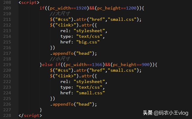
我们首先定义一个函数
| function select_size(){ | |
| //自动获取电脑屏幕宽度 | |
| var pc_width = document.documentElement.clientWidth; | |
| //自动获取电脑屏幕高度 | |
| var pc_height = document.documentElement.clientHeight; | |
| 判断宽度和高度是否在范围 | |
| if((pc_width==1920)&&(pc_height==1200)){ | |
| //大尺寸 | |
| $("#css").attr("href","small.css"); | |
| $("<link>").attr({ | |
| rel: "stylesheet", | |
| type: "text/css", | |
| href: "big.css" | |
| }) | |
| .appendTo("head"); | |
| //小尺寸 | |
| }else if((pc_width==1366)&&(pc_height==900)){ | |
| $("#css").attr("href","small.css"); | |
| $("<link>").attr({ | |
| rel: "stylesheet", | |
| type: "text/css", | |
| href: "small.css" | |
| }) | |
| .appendTo("head"); | |
| } | |
| } |
2.大家也可以使用js来判断,原生的js语法来判断
| <link rel="stylesheet" type="text/css" id="links" href="a.css"/> | |
| <script type="text/javascript"> | |
| window.onload=function(){ | |
| var pm = document.getElementById("links"); | |
| //获取屏幕的宽度 | |
| if(window.screen.width>1024) | |
| { | |
| pm.setAttribute("href","big.css"); | |
| } | |
| else{ | |
| pm.setAttribute("href","small.css"); | |
| } | |
| } | |
| </script> |
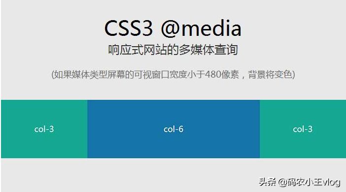
3.使用css自动加载对应文件
//media 是媒体查询的范围,判断屏幕的尺寸大小,这里引用最大宽度是1920像素
<link rel="stylesheet" type="text/css" href="./big.css" media="screen and (max-width:1920px)"/>
<link rel="stylesheet" type="text/css" href="./small.css" media="screen and (min-width:1366px)"/>
4.4.也是使用流媒体自动判断屏幕大小,这个写法就是维护比较麻烦
| @media only screen and (max-width: 1920px) { | |
| .demo1{ | |
| width:50%; | |
| } | |
| .demo2{ | |
| width:50%; | |
| } | |
| .demo3 { | |
| width:50%; | |
| } | |
| } | |
| @media only screen and (min-width: 1200px) { | |
| .demo1{ | |
| width:100%; | |
| } | |
| .demo2{ | |
| width:100%; | |
| } | |
| .demo3 { | |
| width:100%; | |
| } | |
| } |
用这几种方式基本上能够解决大部分的开发上适配的问题