我这里的背景是弹出一个选择规格的菜单。使用vue3+ts,使用组合式api
首先看看在vue3+ts+setup下的使用:
| <template> | |
| <!-- 定义一个按钮,用于打开弹出层 --> | |
| <view style="width:px"> | |
| <button @click="openSpecs">弹出</button> | |
| </view> | |
| <!-- 弹出层视图,注意这里的ref="popup",这里背景特意标红了,方便看到效果 --> | |
| <uni-popup class="updatePopup" background-color="red" ref="popup" type="center"> 你好 </uni-popup> | |
| </template> | |
| <script setup lang="ts"> | |
| import { ref } from "vue"; | |
| // 这里的这个变量名,必须和上面的ref="popup"的变量名相同,这样就相当于绑定了这个元素了 | |
| const popup = ref(null); | |
| // 按钮调用该方法打开弹出层 | |
| function openSpecs() { | |
| popup.value.open(); | |
| } | |
| </script> | |
| <style> | |
| </style> |
从这里可以看出来,弹出层的整体是透明的,而主界面是随着内部的元素大小自适应的。
现在在弹出层中编写复杂的效果
我新建了一个selectSpecs.vue:
| <template> | |
| <view class="background"> | |
| <!-- 标题 --> | |
| <view style="text-align: center"> | |
| <text class="title">{{ title }}</text> | |
| </view> | |
| <!-- 区域滚动视图 --> | |
| <scroll-view scroll-y="true" :style="'height:' + scrollH + 'px'"> | |
| <!-- 结合分组和数据选择器展示数据,不是本文的重点 --> | |
| <uni-group mode="card" top="" v-for="item in specsList" :key="item.key" :title="item.text" id="group"> | |
| <uni-data-checkbox mode="tag" :v-model="item.value" :localdata="item.option"></uni-data-checkbox> | |
| </uni-group> | |
| </scroll-view> | |
| </view> | |
| </template> | |
| <script setup lang="ts"> | |
| import { onMounted, ref } from "vue"; | |
| // 下面都是一些生成数据的逻辑,可以不关心。 | |
| let title = "标题测试"; | |
| interface iOption { | |
| key: number; | |
| text: string; | |
| disable: boolean; | |
| value: number; | |
| } | |
| interface iSpecs { | |
| key: number; | |
| text: string; | |
| value: number; | |
| option: iOption[]; | |
| } | |
| const specsList: iSpecs[] = new Array<iSpecs>(); | |
| for (let i =; i < 10; i++) { | |
| const optionList: iOption[] = new Array<iOption>(i +); | |
| for (let j =; j < i + 1; j++) { | |
| optionList[j] = { | |
| key: j, | |
| text: "属性" + j, | |
| disable: false, | |
| value: j, | |
| }; | |
| } | |
| specsList[i] = { | |
| key: i, | |
| text: "规格" + i, | |
| value: i, | |
| option: optionList, | |
| }; | |
| } | |
| // 这里是为了确定滚动区域的高度,不给高度不滚动的,这里的效果或许还有点问题。 | |
| const scrollH = ref(); | |
| onMounted(() => { | |
| let group = uni.createSelectorQuery().select("#group"); //根据id获取一个规格组的高度 | |
| // prettier-ignore | |
| group.boundingClientRect((data) => { | |
| //计算高度:高度控制在个规格组的高度以内,即3个组以内不需要滚动,+10是因为实测获取的高度比真实高度少一点,不加的话就会需要小范围的滚动一下 | |
| if (specsList.length<){ | |
| scrollH.value=(data.height+)* specsList.length | |
| }else{ | |
| scrollH.value=(data.height+)*3 | |
| } | |
| }).exec(); | |
| }); | |
| </script> | |
| <style> | |
| .background { | |
| background-color: white; | |
| border-radius:px; | |
| } | |
| .title { | |
| font-size: x-large; | |
| font-family: "Times New Roman", Times, Cursive; | |
| text-align: center; | |
| } | |
| </style> |
这里内容看似很长,其实都是为了展示效果,可以不看细节。可以看看我对滚动区域的高度的设置方法。
引入的方式是将上面“你好”改为如下:
| <uni-popup background-color="red" ref="popup" type="center"> | |
| <SelectSpecs></SelectSpecs> | |
| </uni-popup> |
当然组件也是要import的:
| <script setup lang="ts"> | |
| import { ref } from "vue"; | |
| import SelectSpecs from "../goods/view/selectSpecs.vue"; //导入组件 | |
| ....... | |
| </script> |
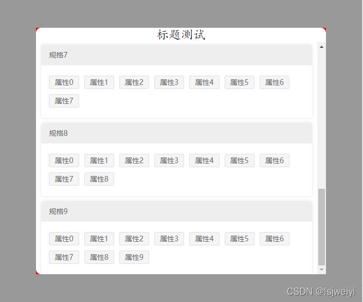
当我数据小的时候,他的效果是这样的:
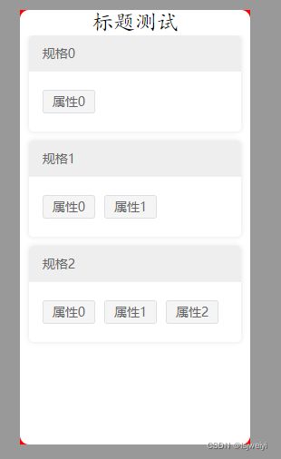
那个四个红角就是背景的颜色。这个效果还可以
当我数据多了之后:
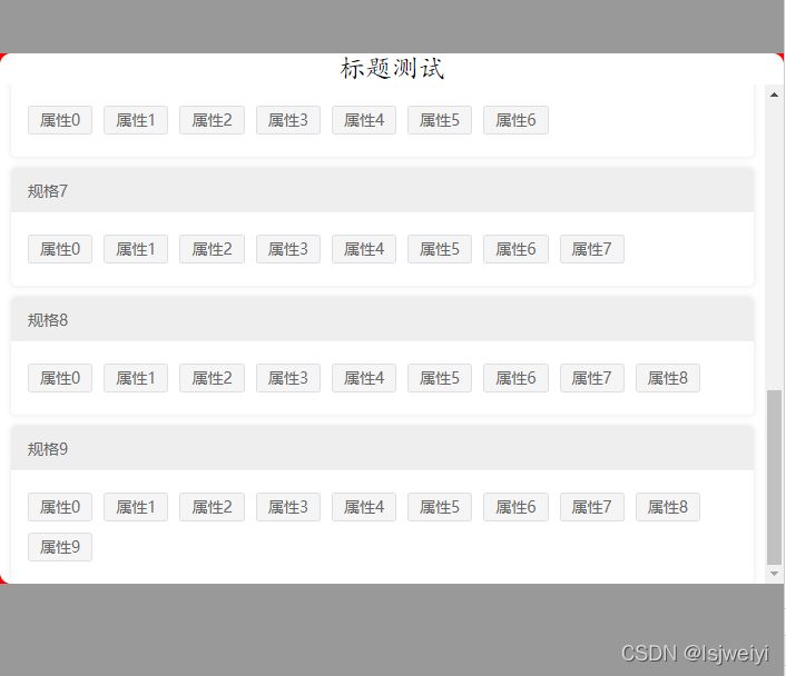
因为宽度自适应,所以宽度是占满了整个屏幕的宽度。你看属性9都换行了。而我希望我的弹出层上下左右都留出一点空间,这样才好看。
我首先想到的是,给这个宽度限制一个最大百分比,用max-width: 80%;,加在background 样式的里面,因为这是整个背景的视图嘛,结果效果是这样的:
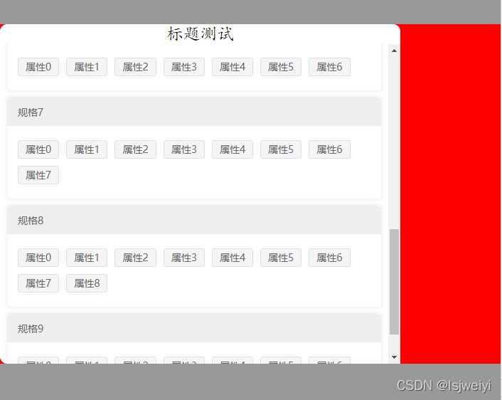
红色背景依然是整个屏幕的宽度,但内容跑左边去了,这不是我想要的效果。再看看数据量小的效果:
这看起来是白色框框占红色背景的80%呀,并不是内容占屏幕的80%呀。还不会居中了。
看来是我的样式加的位置不对,但是uni-popup也没提供这个参数。在uni-popup嵌套一层 view来控制样式:
| <template> | |
| <!-- 定义一个按钮,用于打开弹出层 --> | |
| <view style="width:px"> | |
| <button @click="openSpecs">弹出</button> | |
| </view> | |
| <!-- 弹出层视图,注意这里的ref="popup",这里背景特意标红了,方便看到效果 --> | |
| <view style="max-width:%"> | |
| <uni-popup background-color="red" ref="popup" type="center"> | |
| <SelectSpecs></SelectSpecs> | |
| </uni-popup> | |
| </view> | |
| </template> |
这样也没效果。
于是debug发现,真正控制弹出层主窗体大小的样式是“.uni-popup__wrapper”,难道我要去修改源代码吗?这样不太好,不利于代码移植。
于是就想着有没有办法从子组件修改父组件的样式的方法,结果没找到,倒是找到了父组件修改子组件的样式的方法,于是代码稍微修改一下:
| <uni-popup class="updatePopup" background-color="red" ref="popup" type="center"> | |
| <SelectSpecs></SelectSpecs> | |
| </uni-popup> |
增加了一个样式:
| <style scoped> .updatePopup :deep(.uni-popup__wrapper) { | |
| max-width:%; | |
| } | |
| </style> |
这里注意.vue文件允许有多组<style>,我这里就是新建的一个<style scoped>,然后用深度选择器去修改子组件的样式。
其实父组件与.uni-popup__wrapper中间还隔着一两层view节点,但是:deep也是可以找到这个样式去修改的。
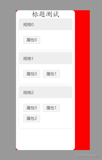
最后效果是这样的:
即使数据多的时候,它也不会把屏幕宽度占满。
其实也是学会了一招修改子组件的样式。
补充:uniapp uni-popup弹出层组件 弹窗 无法弹出 自定义样式问题
之前用到弹出层组件时发现弹出时会有一层灰色的遮罩,后来调试了几次发现是因为没有自定义给弹出层宽高,尝试了几次终于做到自己想要的效果,话不多说,直接附上完整代码:
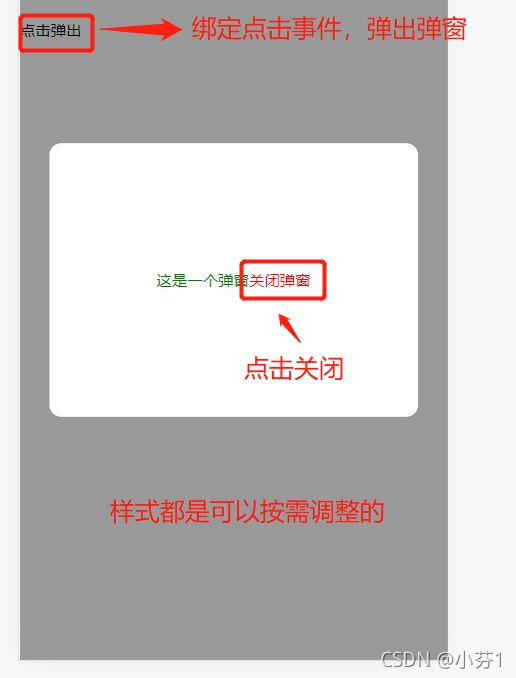
效果图:
| <template> | |
| <view><view class="sign_text" @tap="toggle('center')"> | |
| <text style="line-height:px;margin-top: 12px;">点击弹出</text></view> | |
| <!-- 普通弹窗 --><uni-popup ref="popup" background-color="#fff"> | |
| <view class="popup-content" :class="{ 'popup-height': type === 'left' || type === 'right' }"> <view style="color: green;"> | |
| 这是一个弹窗 | |
| </view> | |
| <view style="color: red;" @click="close()"> | |
| 关闭弹窗 | |
| </view> | |
| </view></uni-popup> | |
| </view> | |
| </template><script> | |
| export default {data() { | |
| return { } | |
| },methods: { | |
| //弹窗开启 toggle(type) { | |
| this.type = type | |
| this.$refs.popup.open(type) | |
| }, //弹窗关闭 | |
| close() { this.$refs.popup.close() | |
| }, } | |
| } | |
| </script><style> | |
| .popup-content {display: flex; | |
| flex-direction: row;align-items: center; | |
| justify-content: center;padding:px; | |
| height:px;width:px; | |
| background-color: #fff;border-radius:px; | |
| }</style> |
下面教一下不会灵活使用的同学这个组件应该怎么用
一、uni-popup弹出层
官网组件地址:https://ext.dcloud.net.cn/pluginid=329
可以先翻看一下官网的介绍,很有用。
二、使用步骤
.首先要去官网把这个组件导入到项目中或者下载到本地,常规放在components文件目录下:
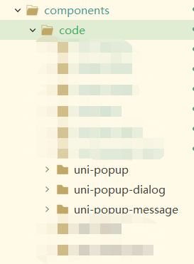
最好是这三个都要一起下载,这样用的时候比较方便,使用的时候按需引入,自定义组件样式就好了