目录
- Flutter 适配组件
- 1. MediaQuery
- 2. LayoutBuilder
- 3. OrientationBuilder
- 4. Expanded 和 Flexible
- 5. FractionallySizedBox
- 6. AspectRatio
Flutter 适配组件
在 Flutter 我们只需要掌握一些 Widget 即可,实际的开发过程中,我们也只需要在合适的地方使用它们即可。
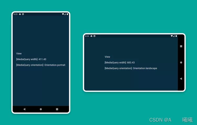
1. MediaQuery
第一个 Widget 即是 MediaQuery,通过它可以直接获得屏幕的大小(宽度 / 高度)和方向(纵向 / 横向)。
| cclass HomePage extends StatelessWidget { | |
| @override | |
| Widget build(BuildContext context) { | |
| Size screenSize = MediaQuery.of(context).size; | |
| Orientation orientation = MediaQuery.of(context).orientation; | |
| return Scaffold( | |
| body: Container( | |
| color: CustomColors.android, | |
| child: Center( | |
| child: Text( | |
| 'View\n\n' + | |
| '[MediaQuery width]: ${screenSize.width.toStringAsFixed()}\n\n' + | |
| '[MediaQuery orientation]: $orientation', | |
| style: TextStyle(color: Colors.white, fontSize:), | |
| ), | |
| ), | |
| ), | |
| ); | |
| } | |
| } |
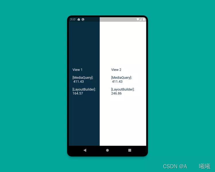
2. LayoutBuilder
使用 LayoutBuilder 组件,可以获得一个 BoxConstraints 对象,通过该对象我们就可以拿到 Widget 的 maxWidth(最大宽度) 和maxHeight(最大高度)
MediaQuery 和 LayoutBuilder 的区别在在于,MediaQuery 得到的是整个屏幕的宽高,而 LayoutBuilder 得到的是特定组件的最大高度和宽度。
| class HomePage extends StatelessWidget { | |
| @override | |
| Widget build(BuildContext context) { | |
| Size screenSize = MediaQuery.of(context).size; | |
| return Scaffold( | |
| body: Row( | |
| children: [ | |
| Expanded( | |
| flex:, | |
| child: LayoutBuilder( | |
| builder: (context, constraints) => Container( | |
| color: CustomColors.android, | |
| child: Center( | |
| child: Text( | |
| 'View\n\n' + | |
| '[MediaQuery]:\n ${screenSize.width.toStringAsFixed()}\n\n' + | |
| '[LayoutBuilder]:\n${constraints.maxWidth.toStringAsFixed()}', | |
| style: TextStyle(color: Colors.white, fontSize:), | |
| ), | |
| ), | |
| ), | |
| ), | |
| ), | |
| Expanded( | |
| flex:, | |
| child: LayoutBuilder( | |
| builder: (context, constraints) => Container( | |
| color: Colors.white, | |
| child: Center( | |
| child: Text( | |
| 'View\n\n' + | |
| '[MediaQuery]:\n ${screenSize.width.toStringAsFixed()}\n\n' + | |
| '[LayoutBuilder]:\n${constraints.maxWidth.toStringAsFixed()}', | |
| style: TextStyle(color: CustomColors.android, fontSize:), | |
| ), | |
| ), | |
| ), | |
| ), | |
| ), | |
| ], | |
| ), | |
| ); | |
| } | |
| } |
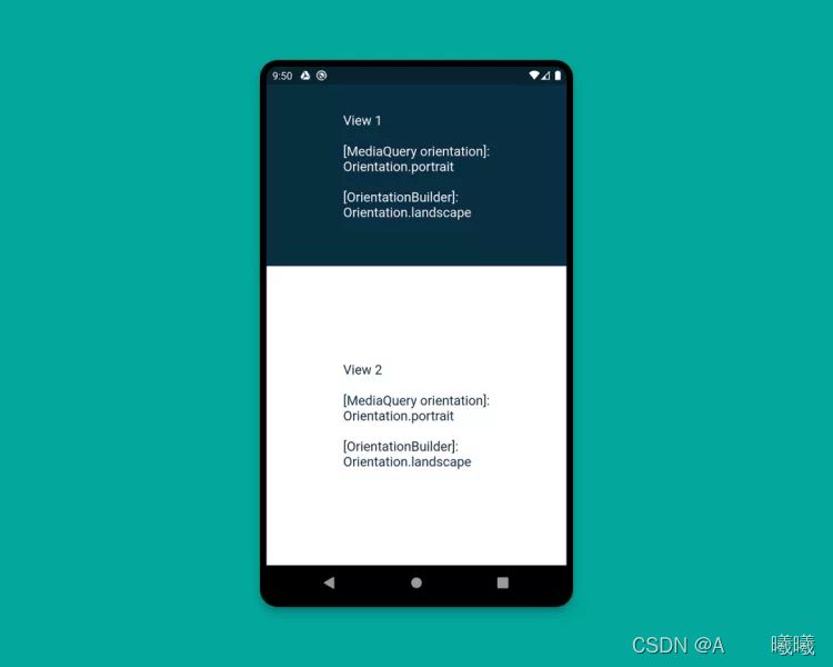
3. OrientationBuilder
要确定当前 Widget 的方向,可以使用 OrientationBuilder 组件。这里的方向与 MediaQuery 提供的设备方向不同。
| class HomePage extends StatelessWidget { | |
| @override | |
| Widget build(BuildContext context) { | |
| Orientation deviceOrientation = MediaQuery.of(context).orientation; | |
| return Scaffold( | |
| body: Column( | |
| children: [ | |
| Expanded( | |
| flex:, | |
| child: Container( | |
| color: CustomColors.android, | |
| child: OrientationBuilder( | |
| builder: (context, orientation) => Center( | |
| child: Text( | |
| 'View\n\n' + | |
| '[MediaQuery orientation]:\n$deviceOrientation\n\n' + | |
| '[OrientationBuilder]:\n$orientation', | |
| style: TextStyle(color: Colors.white, fontSize:), | |
| ), | |
| ), | |
| ), | |
| ), | |
| ), | |
| Expanded( | |
| flex:, | |
| child: OrientationBuilder( | |
| builder: (context, orientation) => Container( | |
| color: Colors.white, | |
| child: Center( | |
| child: Text( | |
| 'View\n\n' + | |
| '[MediaQuery orientation]:\n$deviceOrientation\n\n' + | |
| '[OrientationBuilder]:\n$orientation', | |
| style: TextStyle(color: CustomColors.android, fontSize:), | |
| ), | |
| ), | |
| ), | |
| ), | |
| ), | |
| ], | |
| ), | |
| ); | |
| } | |
| } |
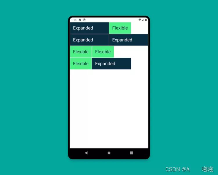
4. Expanded 和 Flexible
Expanded 和 Flexible 这两个组件可以和 Column/Row 搭配使用,来实现非常完美的自适应效果。Expanded 可以用来拓展 Row, 、Column 和 Flex,从而让子组件填充可用空间,Flexible 功能类似但并不一定能填充全部可用空间。
下面这个例子演示了混合使用 Expanded 和 Flexible 的各种方式:
| class HomePage extends StatelessWidget { | |
| @override | |
| Widget build(BuildContext context) { | |
| return Scaffold( | |
| backgroundColor: Colors.white, | |
| body: SafeArea( | |
| child: Column( | |
| children: [ | |
| Row( | |
| children: [ | |
| ExpandedWidget(), | |
| FlexibleWidget(), | |
| ], | |
| ), | |
| Row( | |
| children: [ | |
| ExpandedWidget(), | |
| ExpandedWidget(), | |
| ], | |
| ), | |
| Row( | |
| children: [ | |
| FlexibleWidget(), | |
| FlexibleWidget(), | |
| ], | |
| ), | |
| Row( | |
| children: [ | |
| FlexibleWidget(), | |
| ExpandedWidget(), | |
| ], | |
| ), | |
| ], | |
| ), | |
| ), | |
| ); | |
| } | |
| } | |
| class ExpandedWidget extends StatelessWidget { | |
| @override | |
| Widget build(BuildContext context) { | |
| return Expanded( | |
| child: Container( | |
| decoration: BoxDecoration( | |
| color: CustomColors.android, | |
| border: Border.all(color: Colors.white), | |
| ), | |
| child: Padding( | |
| padding: const EdgeInsets.all(.0), | |
| child: Text( | |
| 'Expanded', | |
| style: TextStyle(color: Colors.white, fontSize:), | |
| ), | |
| ), | |
| ), | |
| ); | |
| } | |
| } | |
| class FlexibleWidget extends StatelessWidget { | |
| @override | |
| Widget build(BuildContext context) { | |
| return Flexible( | |
| child: Container( | |
| decoration: BoxDecoration( | |
| color: CustomColors.androidAccent, | |
| border: Border.all(color: Colors.white), | |
| ), | |
| child: Padding( | |
| padding: const EdgeInsets.all(.0), | |
| child: Text( | |
| 'Flexible', | |
| style: TextStyle(color: CustomColors.android, fontSize:), | |
| ), | |
| ), | |
| ), | |
| ); | |
| } | |
| } |
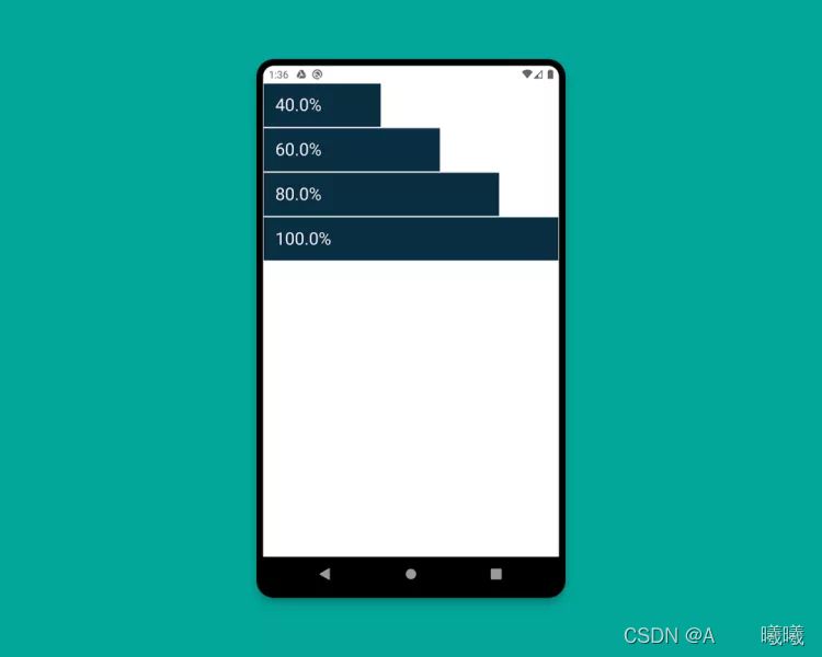
5. FractionallySizedBox
FractionallySizedBox 组件可以使子组件填充部分可用空间,该特性在 Expanded 或 Flexible 中特别有用。
| class HomePage extends StatelessWidget { | |
| @override | |
| Widget build(BuildContext context) { | |
| return Scaffold( | |
| backgroundColor: Colors.white, | |
| body: SafeArea( | |
| child: Column( | |
| mainAxisAlignment: MainAxisAlignment.start, | |
| children: [ | |
| Row( | |
| crossAxisAlignment: CrossAxisAlignment.start, | |
| children: [ | |
| FractionallySizedWidget(widthFactor:.4), | |
| ], | |
| ), | |
| Row( | |
| crossAxisAlignment: CrossAxisAlignment.start, | |
| children: [ | |
| FractionallySizedWidget(widthFactor:.6), | |
| ], | |
| ), | |
| Row( | |
| crossAxisAlignment: CrossAxisAlignment.start, | |
| children: [ | |
| FractionallySizedWidget(widthFactor:.8), | |
| ], | |
| ), | |
| Row( | |
| crossAxisAlignment: CrossAxisAlignment.start, | |
| children: [ | |
| FractionallySizedWidget(widthFactor:.0), | |
| ], | |
| ), | |
| ], | |
| ), | |
| ), | |
| ); | |
| } | |
| } | |
| class FractionallySizedWidget extends StatelessWidget { | |
| final double widthFactor; | |
| FractionallySizedWidget({@required this.widthFactor}); | |
| @override | |
| Widget build(BuildContext context) { | |
| return Expanded( | |
| child: FractionallySizedBox( | |
| alignment: Alignment.centerLeft, | |
| widthFactor: widthFactor, | |
| child: Container( | |
| decoration: BoxDecoration( | |
| color: CustomColors.android, | |
| border: Border.all(color: Colors.white), | |
| ), | |
| child: Padding( | |
| padding: const EdgeInsets.all(.0), | |
| child: Text( | |
| '${widthFactor *}%', | |
| style: TextStyle(color: Colors.white, fontSize:), | |
| ), | |
| ), | |
| ), | |
| ), | |
| ); | |
| } | |
| } |
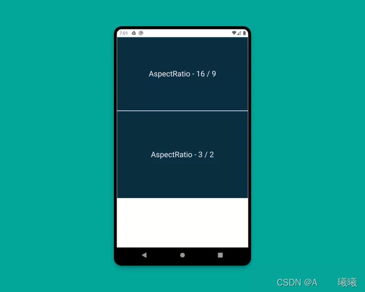
6. AspectRatio
AspectRatio 组件可以直接指定子组件的固定宽高比例,使用时,我们可以使用布局约束的最大宽度,并给定一个宽高比自适应其高度
| class HomePage extends StatelessWidget { | |
| @override | |
| Widget build(BuildContext context) { | |
| return Scaffold( | |
| backgroundColor: Colors.white, | |
| body: SafeArea( | |
| child: Column( | |
| children: [ | |
| AspectRatioWidget(ratio: ' / 9'), | |
| AspectRatioWidget(ratio: ' / 2'), | |
| ], | |
| ), | |
| ), | |
| ); | |
| } | |
| } | |
| class AspectRatioWidget extends StatelessWidget { | |
| final String ratio; | |
| AspectRatioWidget({@required this.ratio}); | |
| @override | |
| Widget build(BuildContext context) { | |
| return AspectRatio( | |
| aspectRatio: Fraction.fromString(ratio).toDouble(), | |
| child: Container( | |
| decoration: BoxDecoration( | |
| color: CustomColors.android, | |
| border: Border.all(color: Colors.white), | |
| ), | |
| child: Padding( | |
| padding: const EdgeInsets.all(.0), | |
| child: Center( | |
| child: Text( | |
| 'AspectRatio - $ratio', | |
| style: TextStyle(color: Colors.white, fontSize:), | |
| ), | |
| ), | |
| ), | |
| ), | |
| ); | |
| } | |
| } |