介绍
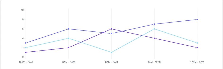
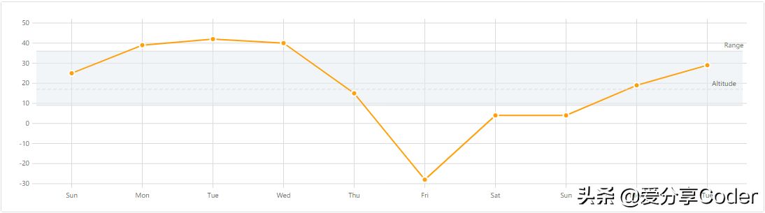
今天介绍一个小巧的Web端的SVG图表库,FrappeCharts是受GitHub启发的简单且现代的SVG图表,零依赖性。相比市面很多类似的库,FrappeCharts显得相当轻量了!

Github
https://github.com/frappe/charts
安装使用
- 安装
yarn add frappe-gantt
或直接将其包含在HTML中
<script src="https://unpkg.com/frappe-charts@latest"></script>
- 用法
并将其包含在您的项目中
import { Chart } from "frappe-charts"
初始化一个新的Charts对象
| new Chart(); // ES6 module | |
| // ornew frappe.Chart(); // Browser |
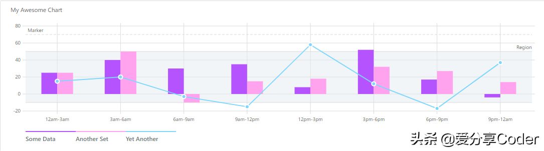
- 图表制作
| let chart = new frappe.Chart( "#frost-chart", { | |
| data: { | |
| labels: ["12am-3am", "3am-6am", "6am-9am", "9am-12pm", | |
| "12pm-3pm", "3pm-6pm", "6pm-9pm", "9pm-12am"], | |
| datasets: [ | |
| { | |
| name: "Some Data", chartType: 'bar', | |
| values: [25, 40, 30, 35, 8, 52, 17, -4] | |
| }, | |
| { | |
| name: "Another Set", chartType: 'bar', | |
| values: [25, 50, -10, 15, 18, 32, 27, 14] | |
| }, | |
| { | |
| name: "Yet Another", chartType: 'line', | |
| values: [15, 20, -3, -15, 58, 12, -17, 37] | |
| } | |
| ], | |
| yMarkers: [{ label: "Marker", value: 70, | |
| options: { labelPos: 'left' }}], | |
| yRegions: [{ label: "Region", start: -10, end: 50, | |
| options: { labelPos: 'right' }}] | |
| }, | |
| title: "My Awesome Chart", | |
| type: 'axis-mixed', // or 'bar', 'line', 'pie', 'percentage' | |
| height: 300, | |
| colors: ['purple', '#ffa3ef', 'light-blue'], | |
| tooltipOptions: { | |
| formatTooltipX: d => (d + '').toUpperCase(), | |
| formatTooltipY: d => d + ' pts', | |
| }}); | |
| chart.export(); |

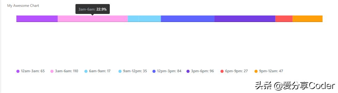

| let heatmap = new frappe.Chart("#heatmap", { | |
| type: 'heatmap', | |
| title: "Monthly Distribution", | |
| data: { | |
| dataPoints: { | |
| '1524064033': 8, /* ... */}, | |
| // 带有时间戳-值对的对象 | |
| start: startDate | |
| end: endDate // 日期对象 | |
| }, | |
| countLabel: 'Level', | |
| discreteDomains: 0 // default: 1 | |
| colors: ['#ebedf0', '#c0ddf9', '#73b3f3', '#3886e1', '#17459e'], | |
| }); |
总结
由于FrappeCharts受了Github的启发,其风格和Github类似,足够轻量,功能在不是特别复杂需求的情况下完全够用,enjoy it!