1. 前言
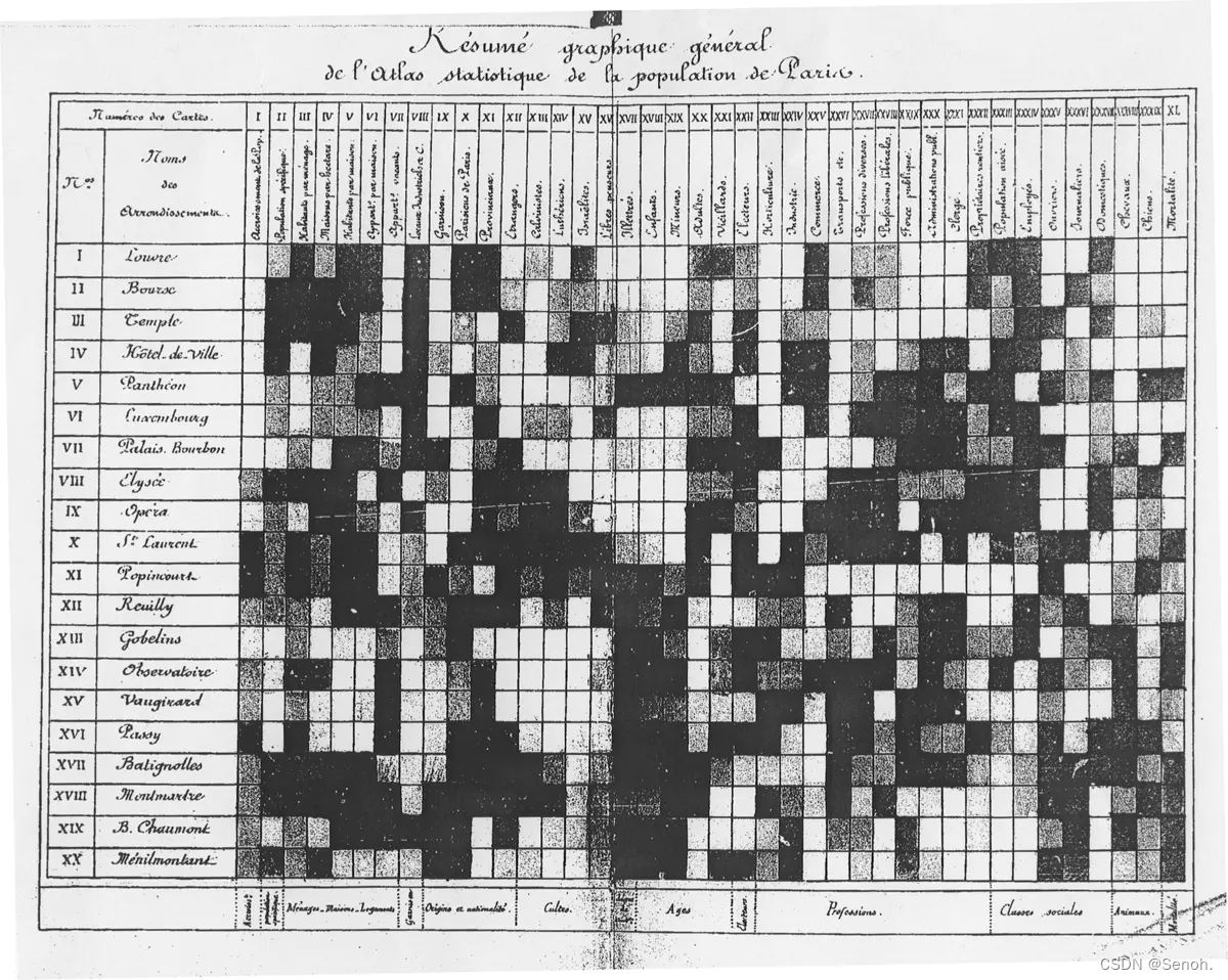
热图比较有意思,最常用的科研可视化做图,观察显著、直接、简单粗暴。这是Toussaint Loua在1873年就曾使用过热图来绘制对巴黎各区的社会学统计。
2. 基本图形
以下均使用mtcars数据集作图:
| rm(list = ls()) | |
| df <- scale(mtcars) | |
| dat <- mtcars |
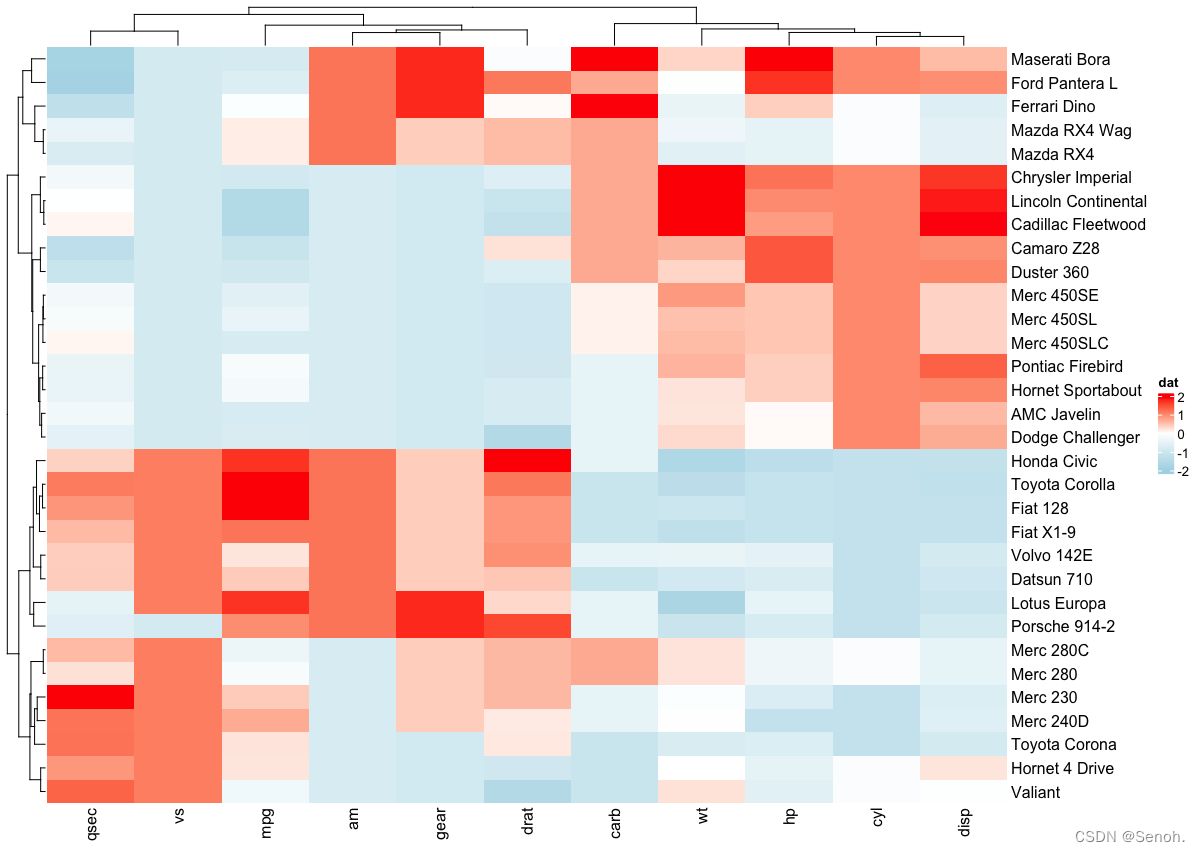
2.1 经典简单热图
| library(circlize) | |
| mycols <- colorRamp2(breaks = c(-2, 0, 2), | |
| colors = c("lightblue", "white", "red")) | |
| Heatmap(df, name = "dat", col = mycols) |
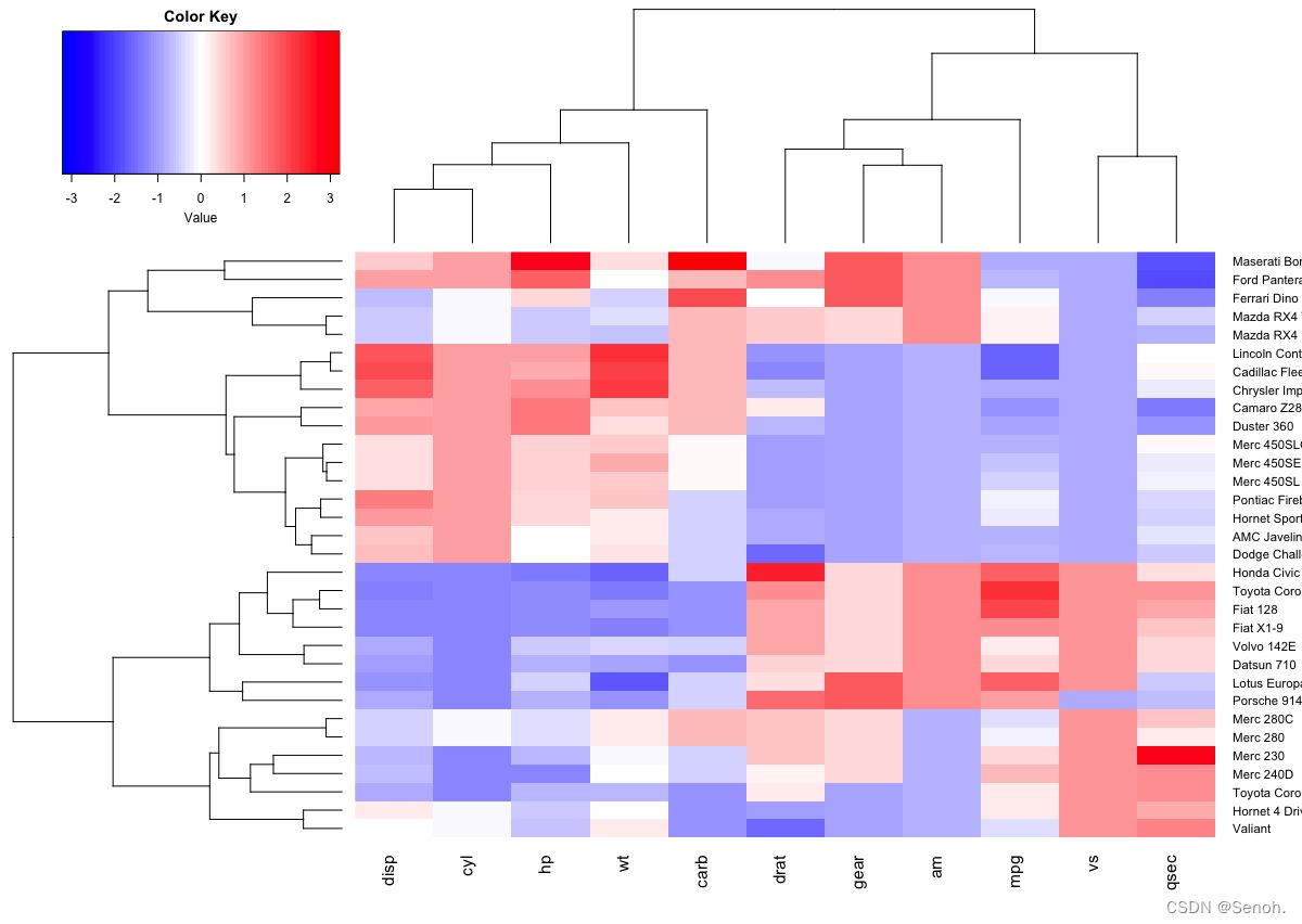
2.2 用heatmap2.0画热图
| library("gplots") | |
| heatmap.2(df, scale = "none", col = bluered(100), | |
| trace = "none", density.info = "none") |
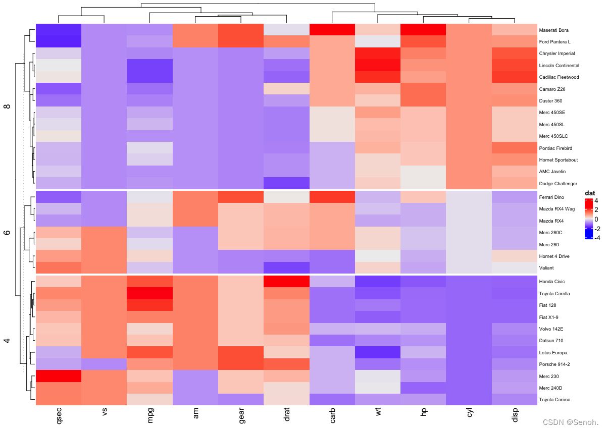
2.3 拆分热图
| Heatmap(df, name = "dat", split = dat$cyl, | |
| row_names_gp = gpar(fontsize = 7)) |
2.4 分类热图
| library("RColorBrewer") | |
| col <- colorRampPalette(brewer.pal(10, "RdYlBu"))(256) | |
| heatmap(df, scale = "none", col = col, | |
| RowSideColors = rep(c("blue", "pink"), each = 16), | |
| ColSideColors = c(rep("purple", 5), rep("orange", 6))) |

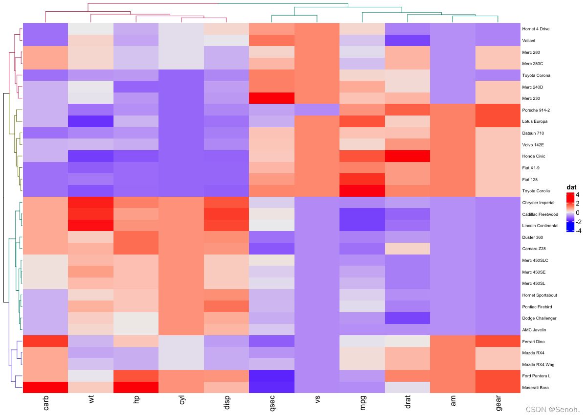
2.5 聚类树上色
| #install.packages("dendextend") | |
| library(dendextend) | |
| row_dend = hclust(dist(df)) # 行聚类 | |
| col_dend = hclust(dist(t(df))) # 列聚类 | |
| Heatmap(df, name = "dat", | |
| row_names_gp = gpar(fontsize = 6.5), | |
| cluster_rows = color_branches(row_dend, k = 4), | |
| cluster_columns = color_branches(col_dend, k = 2)) |
3. 进阶画图
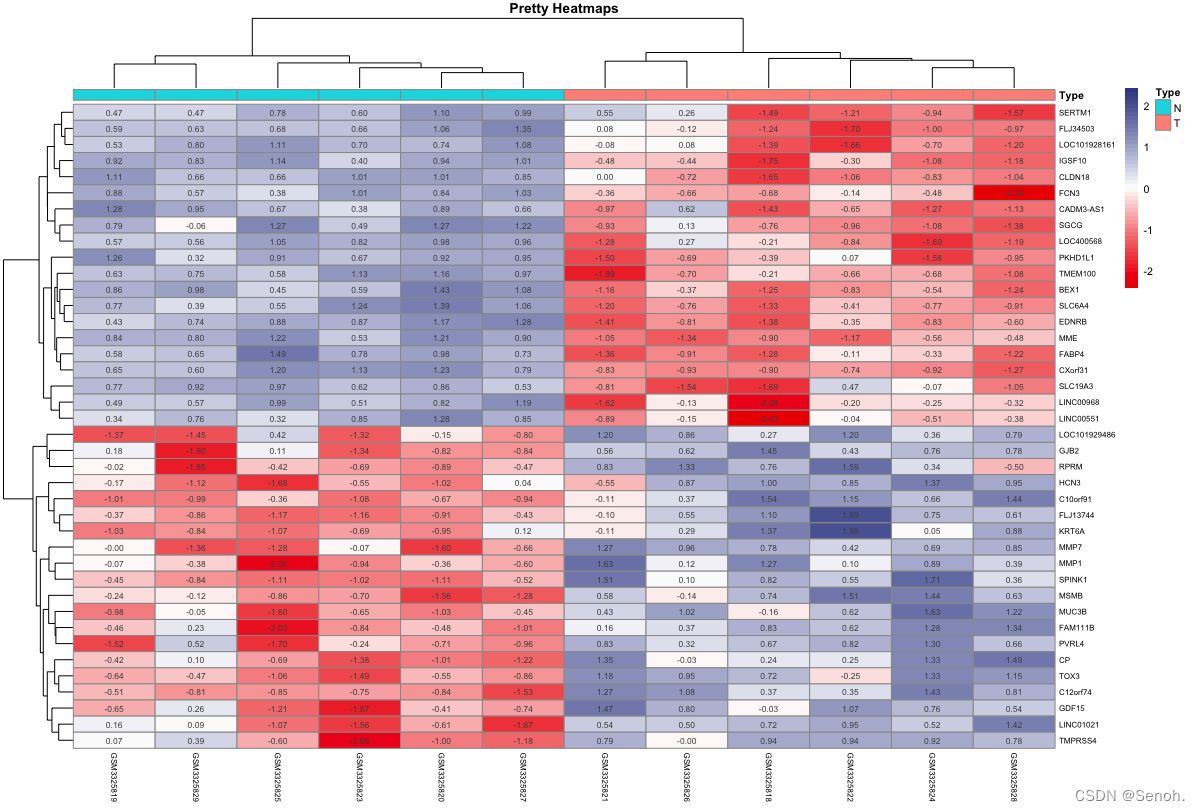
3.1 简单分组热图
这是热图最常见的形式,常用于样本正常组和疾病组之间的谱系表达差异
| library(ComplexHeatmap) | |
| library(pheatmap) | |
| norcol="#EE0000FF" #疾病组 | |
| concol="#3B4992FF" #正常组 | |
| #读取文件 | |
| rt=read.table(inputFile,header=T,sep="\t",check.names=F,row.names=1) | |
| group=read.table(groupFile,header=T,sep="\t",row.names=1,check.names=F) | |
| rt <- as.matrix(rt) | |
| pdf(file=outFile,width=8,height=7) | |
| pheatmap(rt, | |
| annotation=group, | |
| main = "The Pretty Heatmaps by myself",#标题 | |
| cluster_cols = T, | |
| color = colorRampPalette(c(norcol, "white", concol))(50), | |
| show_colnames = T, | |
| scale="row", #矫正 | |
| #border_color ="NA", | |
| display_numbers = TRUE, #单元格数值 | |
| #cellwidth = 15, cellheight = 12,#设置单元格大小 | |
| fontsize = 8, | |
| fontsize_row=6, | |
| fontsize_col=6) | |
| dev.off() |
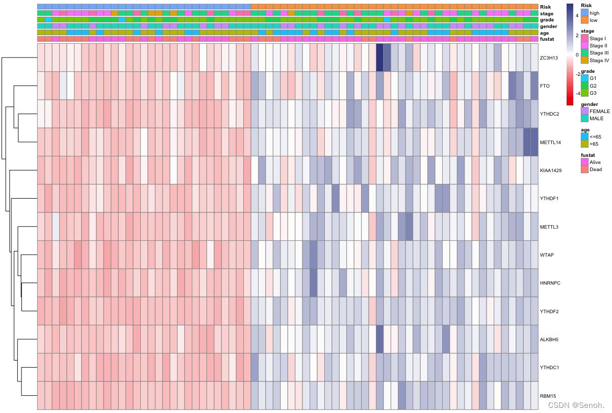
3.2 多性状分组热图
相比于常规转录组分析,多形状更倾向于描述性统计可视化谱系,可以附上各个需要展示的临床形状,结果简单直观
| library(pheatmap) | |
| var="Risk" #按照风险排序 | |
| norcol="#EE0000FF" #疾病组 | |
| concol="#3B4992FF" #正常组 | |
| #读取文件 | |
| rt=read.table(inputFile, sep="\t", header=T, row.names=1, check.names=F) | |
| Type=read.table(groupFile, sep="\t", header=T, row.names=1, check.names=F) | |
| #样品取交集 | |
| sameSample=intersect(colnames(rt),row.names(Type)) | |
| rt=rt[,sameSample] | |
| Type=Type[sameSample,] | |
| Type=Type[order(Type[,var]),] #按临床性状排序 | |
| rt=rt[,row.names(Type)] | |
| #绘制热图 | |
| pdf(outFile,height=5,width=8) | |
| pheatmap(rt, annotation=Type, | |
| color = colorRampPalette(c(norcol, "white", concol))(90), | |
| cluster_cols =F, #是否聚类 | |
| scale="row", #基因矫正 | |
| show_colnames=F, | |
| fontsize=7.5, | |
| fontsize_row=7, | |
| fontsize_col=5) | |
| dev.off() |
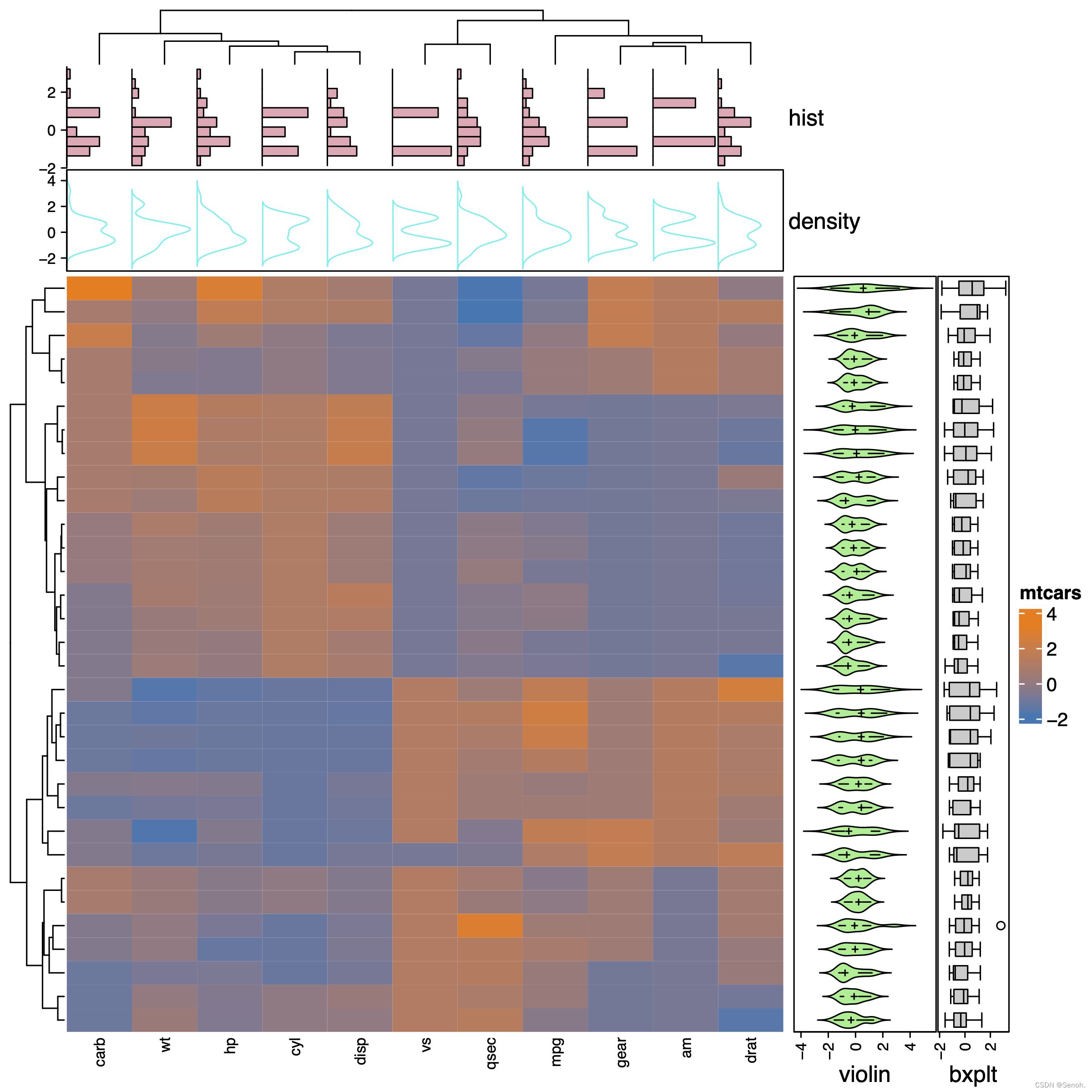
3.3 组合型热图
和上图目的类似,不过这里是依据每个样本或者每个基因进行小提琴图、条形图等可视化
找不到合适的数据,这里用的还是==mtcars==的数据
| library(ComplexHeatmap) | |
| #读取文件 | |
| dat=read.table(inputFile,header=T,sep="\t",check.names=F,row.names=1) | |
| dat <- as.matrix(dat) | |
| # 列的标注做图 | |
| .hist = anno_histogram(dat, gp = gpar(fill = "pink2")) | |
| .density = anno_density(dat, type = "line", gp = gpar(col = "cyan2")) | |
| ha_mix_top = HeatmapAnnotation( | |
| hist = .hist, density = .density, | |
| height = unit(3.8, "cm") | |
| ) | |
| # 行的标注做图 | |
| .violin = anno_density(dat, type = "violin", | |
| gp = gpar(fill = "lightgreen"), which = "row") | |
| .boxplot = anno_boxplot(dat, which = "row") | |
| ha_mix_right = HeatmapAnnotation(violin = .violin, bxplt = .boxplot, | |
| which = "row", width = unit(4, "cm")) | |
| # 将标注结合到热图上 | |
| pdf(outFile,height=8,width=8) | |
| Heatmap(dat, name = "mtcars", col = c(ggsci::pal_d3()(2)), | |
| column_names_gp = gpar(fontsize = 8), | |
| top_annotation = ha_mix_top) + ha_mix_right | |
| dev.off() |
4. 讨论
热图的最大特点就是通过两种或以上的颜色直观反映部分数据的差异分布,以上大部分数据采用初始包的mtcars数据集。