2D转换
在二维的平面上做一些变化,使用transform属性
2D转换之移动(将div在屏幕中居中)translate
| <style type="text/css"> | |
| div{ | |
| width:200px; | |
| height:200px; | |
| background-color:#090; | |
| position:absolute; /*绝对定位*/ | |
| left:50%; | |
| top:50%; | |
| transform:translate(-50%,-50%); /*以自己左上角为原点,向左移动50%,向上移动50%*/ | |
| } | |
| </style> |
2D转换之旋转(rotate)
默认情况下是按中心点旋转,我们可以通过transform-origin调中心点,
| <style type="text/css"> | |
| div{ | |
| width:200px; | |
| height:200px; | |
| background-color:#090; | |
| margin:100px auto; | |
| transform-origin:top left; /*旋转的中心点,中心点在左上角*/ | |
| } | |
| div:hover{ | |
| transform:rotate(45deg); /*deg表示度数*/ | |
| } | |
| </style> |
2D转换之缩放(scale)
| <style type="text/css"> | |
| div{ | |
| width:200px; | |
| height:200px; | |
| background-color:#090; | |
| margin:100px auto; | |
| } | |
| div:hover{ | |
| /*transform:scale(0.5);*/ /*x轴和Y轴都是缩放0.5倍*/ | |
| /*transform:scaleX(0.5);*/ /*在x的方向上缩放0.5倍*/ | |
| transform:scale(2,3); | |
| } | |
| </style> |
2D转换之斜切(skew)
| <style type="text/css"> | |
| div{ | |
| width:200px; | |
| height:200px; | |
| background-color:#090; | |
| margin:100px auto; | |
| } | |
| div:hover{ | |
| /*transform:skewX(8deg);*/ | |
| transform:skewY(10deg); | |
| } | |
| </style> |
例题:三角的做法
| <style type="text/css"> | |
| div{ | |
| width:300px; | |
| height:40px; | |
| border:#5c5c5c solid 1px; | |
| margin:100px auto; | |
| position:relative; | |
| } | |
| div:after{ | |
| content:''; | |
| width:12px; | |
| height:12px; | |
| display:block; | |
| border-right:#5c5c5c solid 2px; | |
| border-bottom:#5c5c5c solid 2px; | |
| position:absolute; | |
| top:50%; | |
| right:12px; | |
| transform:translateY(-50%) rotate(45deg); | |
| } | |
| div:hover{ | |
| border:#009 solid 1px; | |
| } | |
| div:hover:after{ | |
| border-right:#009 solid 2px; | |
| border-bottom:#009 solid 2px; | |
| } | |
| </style> | |
| <div></div> |
过渡(transition)
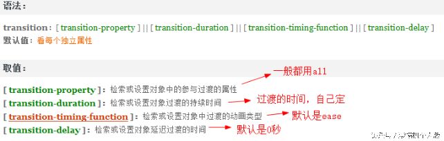
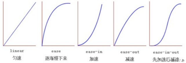
动画过渡类型
小例题
| <style type="text/css"> | |
| div{ | |
| width:200px; | |
| height:100px; | |
| border:#00F solid 3px; | |
| background-color:#F90; | |
| margin:100px auto; | |
| border-radius:15px; | |
| /*transition:width 0.5s ease 0s;*/ | |
| /*transition:all 0.5s ease 2s;*/ | |
| transition:all 0.5s; | |
| } | |
| div:hover{ | |
| width:300px; | |
| height:150px; | |
| background:#F30; | |
| } | |
| </style> | |
| <div></div> |
例题:头像旋转

| <style type="text/css"> | |
| img{ | |
| border:#093 solid 4px; | |
| display:block; | |
| margin:100px auto; | |
| border-radius:50%; | |
| transition:all 1s ease 0; | |
| } | |
| img:hover{ | |
| transform:rotate(360deg); | |
| } | |
| </style> | |
| <img src="images/face.jpg"> |
例题:鼠标经过图片变大
| <style type="text/css"> | |
| div{ | |
| width:200px; | |
| height:200px; | |
| border:#666 solid 1px; | |
| margin:100px auto; | |
| overflow:hidden; | |
| } | |
| div img{ | |
| transition:all 0.5s; | |
| cursor:pointer; | |
| } | |
| div img:hover{ | |
| transform:scale(1.1); | |
| } | |
| </style> | |
| <div><img src="images/face.jpg"></div> |
3D转换
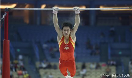
3D转换之X轴旋转
X轴的旋转就像单杠的旋转。
例题:

| <style type="text/css"> | |
| div{ | |
| width:200px; | |
| height:200px; | |
| margin:100px auto; | |
| border:#000 solid 1px; | |
| perspective:400px; /*透视的效果,这个属性必须给父元素添加*/ | |
| } | |
| img{ | |
| transform-origin:bottom; | |
| transition:all 0.5s | |
| } | |
| div:hover img{ | |
| transform:rotateX(60deg); /*X轴旋转60度*/ | |
| } | |
| </style> | |
| <div><img src="images/face.jpg"></div> |
例题:打开盒子(3D转换之X轴旋转)

完整代码:
| <style type="text/css"> | |
| #content{ | |
| width:300px; | |
| height:300px; | |
| margin:50px auto; | |
| position:relative; | |
| } | |
| #face1,#face2{ | |
| width:300px; | |
| height:300px; | |
| background:url(images/musicb.jpg) no-repeat; | |
| position:absolute; | |
| top:0px; | |
| left:0px; | |
| border:#666 solid 1px; | |
| border-radius:50%; | |
| } | |
| #face2{ | |
| background:url(images/musict.jpg) no-repeat; | |
| transform-origin:bottom; | |
| transition:all 2s; | |
| } | |
| #content:hover #face2{ | |
| transform:rotateX(180deg); | |
| } | |
| </style> | |
| </head> | |
| <body> | |
| <div id="content"> | |
| <div id="face1"></div> | |
| <div id="face2"></div> | |
| </div> |
3D转换之Y轴(百度钱包)
Y轴旋转就像钢管舞,沿着Y轴方向旋转。

例题

完整代码:
| <style type="text/css"> | |
| body{ | |
| background:#f14849; | |
| } | |
| #content{ | |
| width:300px; | |
| height:300px; | |
| margin:100px auto; | |
| position:relative; | |
| } | |
| #face1,#face2{ | |
| width:300px; | |
| height:300px; | |
| background:url(images/baidu_bg.png) no-repeat left bottom; | |
| position:absolute; | |
| top:0px; | |
| left:0px; | |
| transition:all 1s; | |
| backface-visibility:hidden; /*转过去以后隐藏*/ | |
| } | |
| #face1{ | |
| z-index:1; | |
| } | |
| #face2{ | |
| background-position:-305px bottom; /*css中spirits技术*/ | |
| transform:rotateY(-180deg); | |
| } | |
| #content:hover #face1{ | |
| transform:rotateY(-180deg); | |
| } | |
| #content:hover #face2{ | |
| transform:rotateY(0deg); | |
| } | |
| </style> | |
| </head> | |
| <body> | |
| <div id="content"> | |
| <div id="face1"></div> | |
| <div id="face2"></div> | |
| </div> |
例题:抽奖

| <style type="text/css"> | |
| #content{ | |
| width:650px; | |
| height:600px; | |
| background:url(images/turntable-bg.jpg) no-repeat; | |
| margin:auto; | |
| overflow:hidden; | |
| position:relative; | |
| } | |
| #zhuan{ | |
| width:450px; | |
| height:450px; | |
| background:url(images/turntable.png) no-repeat; | |
| margin:60px 0px 0px 115px; | |
| transition:all 3s ease 0; | |
| } | |
| #content img{ | |
| position:absolute; | |
| top:150px; | |
| left:250px; | |
| cursor:pointer; | |
| } | |
| </style> | |
| <script src="js/jquery-1.8.3.min.js"></script> | |
| <script type="text/javascript"> | |
| $(document).ready(function(e) { | |
| $('#content img').click(function(e) { | |
| var num=Math.floor(Math.random()*3600); //求得随机的旋转度数 | |
| $('#zhuan').css('transform','rotate('+num+'deg)'); | |
| num%=360; //num=num%360; | |
| setTimeout(function(){ | |
| if(num<=51.4*1) | |
| { | |
| alert('免单4999'); | |
| } | |
| else if(num<=51.4*2) | |
| { | |
| alert('免单50元') | |
| } | |
| else if(num<=51.4*3) | |
| { | |
| alert('免单10元'); | |
| } | |
| else if(num<=51.4*4) | |
| { | |
| alert('免单5元') | |
| } | |
| else if(num<=51.4*5) | |
| { | |
| alert('免分期服务费'); | |
| } | |
| else if(num<=51.4*6) | |
| { | |
| alert('提高白条额度'); | |
| } | |
| else if(num<=51.4*7) | |
| { | |
| alert('未中奖'); | |
| } | |
| },3000) | |
| }); | |
| }); | |
| </script> | |
| <div id="content"> | |
| <div id="zhuan"></div> | |
| <img src="images/pointer.png"> | |
| </div> |
获取相关例题及更多文章请关注公众号“爱搞机个人版”
首先祝贺自己过了新手期,每天可以发五篇文章啦!可以让大家每天学到饱,哈哈!
最终解释权归爱搞机个人版所有!