我们在使用css来布局时经常需要进行居中,有时一个属性就能搞定,有时则需要一定的技巧才能兼容到所有浏览器,利用css来实现对象的垂直居中有许多不同的方法,比较难的是应该选择哪种正确的方法。比如我们都知道 margin:0 auto;的样式能让元素水平居中,而margin: auto;却不能做到垂直居中……下面就css居中的一些常用方法做个集中的介绍。
首先是水平居中,最简单的办法当然就是:
margin:0 auto;
文字的水平居中方法:
利用line-height设为height的一样即可:
eg:
| .div { | |
| width:200px; | |
| height: 200px; | |
| line-height: 200px;/*实现垂直居中的关键*/ | |
| text-align:center; | |
| font-size: 36px; | |
| background-color: #ccc; | |
| } |
绝对定位居中
父容器元素:position: relative,子元素:position:absolute;
eg:
| <div class="box"> | |
| <div class="content"></div> | |
| </div> | |
| <style> | |
| .box{position:relative;width:200px;height:200px;background:#999;} | |
| .content{ | |
| width: 50%; | |
| height: 50%; | |
| overflow: auto; | |
| margin: auto; | |
| position: absolute; | |
| top: 0; left: 0; bottom: 0; right: 0; | |
| background:#C9F;} | |
| </style> |
效果如下所示:
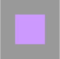
!注意:高度必须定义,建议加 overflow: auto,防止内容溢出。
flex居中
介绍一下CSS3中的display:flex来实现的水平垂直居中的方法。
eg:
| <div class="parent"> | |
| <div class="children">我是通过flex的水平垂直居中噢!</div> | |
| </div> | |
| <style> | |
| .parent { | |
| display:flex; | |
| align-items: center;/*垂直居中*/ | |
| justify-content: center;/*水平居中*/ | |
| width:200px; | |
| height:200px; | |
| background-color:green; | |
| } | |
| .children { | |
| background-color:blue; | |
| color:#FFF; | |
| } | |
| </style> |
效果如下所示:
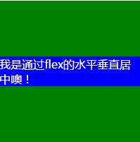
这种方式最为简便,就是兼容性不好,不过随着时间的前进,各大浏览器一定会都兼容的。