本文为方便讲述重构去除了 Element、vux 库,用了最近比较火的 bulma 轻量、快捷、易读。
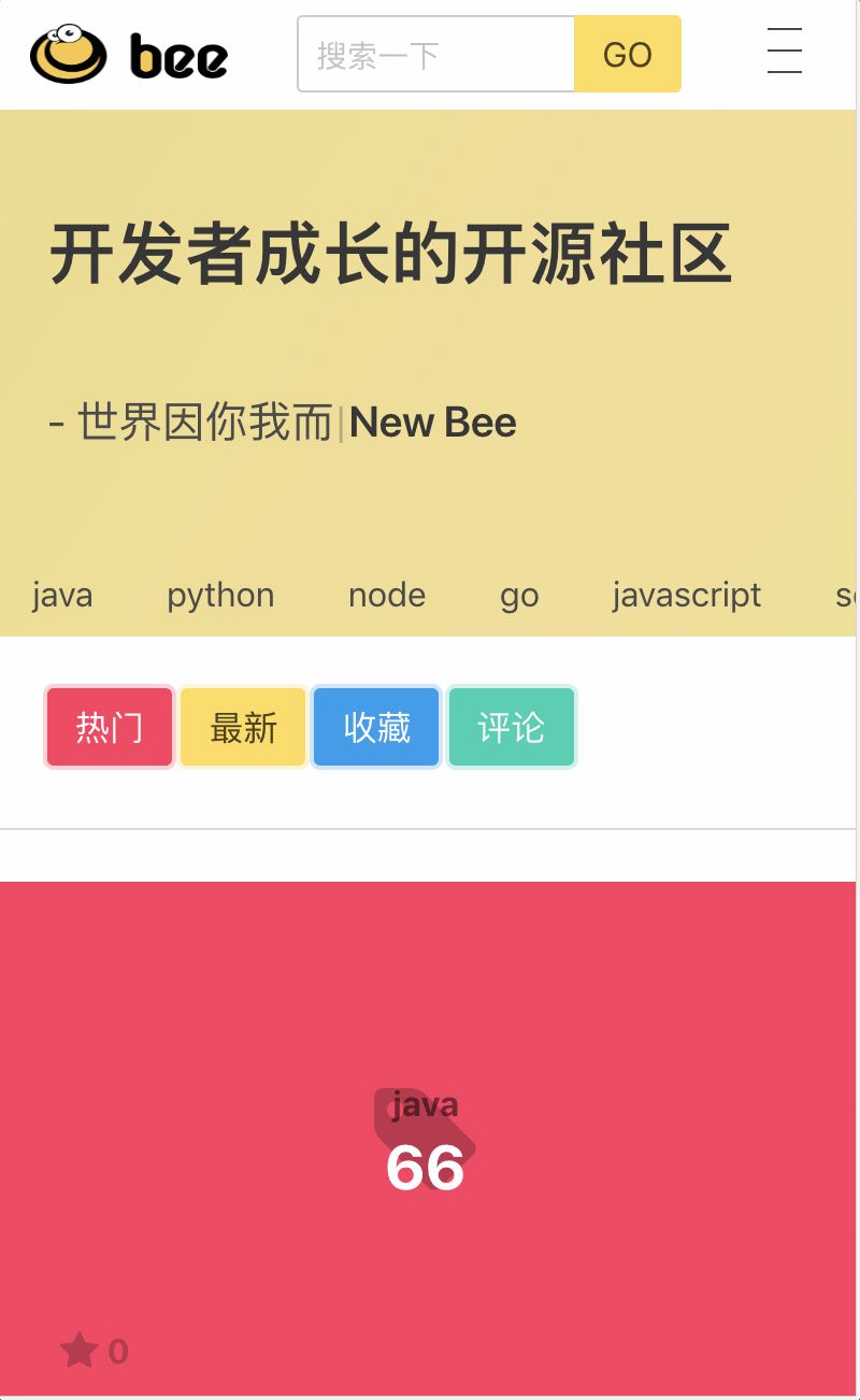
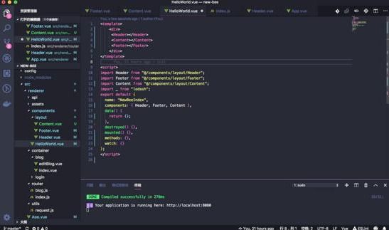
项目截屏
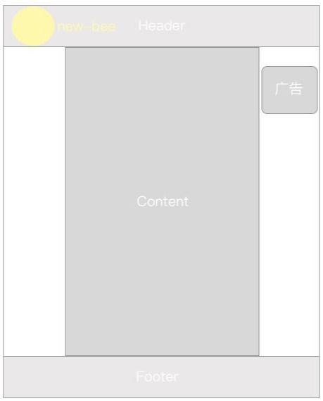
Layout and Components
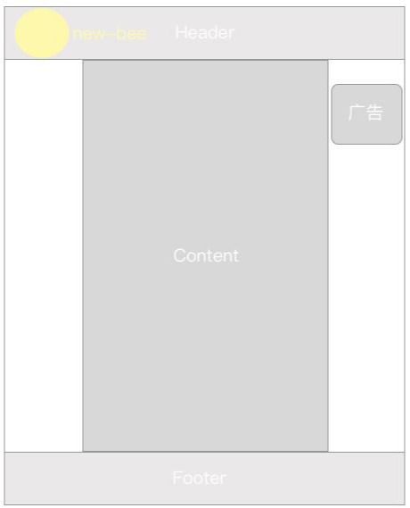
Layout
首先,似上图,我们思考把一个小型网站拆成三部分:页头(Header)、内容(Content)、页脚(Footer) 这几乎每个网站内都必须有的,通常把万年不变的:页头(Header)、页脚(Footer) 制作成 Layout 方便通用。
Components
再把内容(Content)根据业务进行拆分成 组件(Components)
如上图:Header 和 Content :Header其实没有拆分的必要,没有可以重用的组件,而 Conntent 是必须要拆分的布局元素。因为动态网站 Conntent 随着内容的变化而变化,内容多,可重用的东西的概率越高,需要把能重用的东西提炼出来
1、节省代码、提高代码阅读性
2、便于修改 (比如更新广告)
开始写代码
接着我们的 第二章上传的源码 开始,基于它继续完善小网站布局和组件化。
值得一提的是:本系列教程一章跟随一章并且每一章可以独立运行,章与章之间完美衔接,没有 “突然出现” 的代码段。不会给新手无从下手的感觉,如果那你对代码陌生,那你该认真翻翻往期文章了。你可以基于上一章逐步写代码,也可以下载本章简单预览代码。
- 引入 bulma 样式 CDN
| vim new-bee/index.html | |
| <!-- font --><link href="//cdn.bootcss.com/font-awesome/4.7.0/css/font-awesome.min.css" rel="stylesheet"><!-- css --><link rel="stylesheet" href="https://cdnjs.cloudflare.com/ajax/libs/bulma/0.6.0/css/bulma.min.css"> | |
- 新建 Layout 目录
| vim new-bee/src/renderer/components/layout | |
- Layout 目录下建立 Header.vue 模板组件
这个组件专门写头部的内容,最好配合栅格尽可能写出简单的响应式组件
| <template><div id="bee-header" element-loading-text="正在努力请求github..." element-loading-background="rgba(0, 0, 0, 0.8)"><!-- 遮罩 --><div :class=" loading ? `modal is-active` : `modal` " style="background-color: #ffffff36"> | |
| < img src="https://img.actd.tw/images/2018/11/17/ezgif-4-05f4bba41fef.gif" style="width: 300px" alt=""> | |
| </div><div class="is-underline "><div class="container"><nav class="navbar "><div class="navbar-brand"><a class="navbar-item" > | |
| < img src="https://img.actd.tw/images/2018/11/17/bee.png" alt="Bulma: a modern CSS framework based on Flexbox" width="92" height="28"> | |
| </a > | |
| <div class="login-before is-hidden-mobile" style="padding-top: 5px;"><a class="navbar-item is-hidden-desktop" href=" " target="_blank"><span class="icon" style="color: #333;"><i class="fa fa-lg fa-github is-size-2"></i></span> | |
| </a > | |
| </div><div class="navbar-item is-hidden-desktop "><div class="field has-addons" ><div class="control" ><input type="input" class="input" name="email" placeholder="搜索一下" required="required" style="height: 36.4px;width:130px"><input type="hidden" name="redirect" id="name" value="/fr/#thanks"></div><div class="control" ><input type="submit" class="button is-warning" value="GO"></div></div></div> | |
| <div class="navbar-burger burger" data-target="navMenuDocumentation" ><span></span><span></span><span></span></div></div><div id="navMenuDocumentation" class="navbar-menu"><div class="navbar-start"><div class="navbar-item has-dropdown is-hoverable"><a class="navbar-link is-active"> | |
| 发现 | |
| </a > | |
| <div class="navbar-dropdown "><a class="navbar-item " type="收藏集"> | |
| 收藏集 | |
| </a > | |
| <a class="navbar-item" type="徽章"> | |
| 徽章 | |
| </a > | |
| <a class="navbar-item " type="排名"> | |
| 排名 | |
| </a > | |
| <a class="navbar-item " type="职场生活"> | |
| 职场生活 | |
| </a > | |
| </div></div><a class="navbar-item " href="https://bulma.io/expo/"><!--<span class="bd-emoji">:star:️</span>--> | |
| 专栏 | |
| </a > | |
| <a class="navbar-item " href="https://bulma.io/expo/"><!--<span class="bd-emoji">:star:️</span>--> | |
| 聊天 | |
| <!-- 很多人不知道干什么。。。 --> | |
| </a > | |
| <a class="navbar-item " href="https://bulma.io/expo/"><!--<span class="bd-emoji">:star:️</span>--> | |
| 面经 | |
| </a > | |
| <router-link class="navbar-item " to="/book"><!--<span class="bd-emoji">:heart:</span>--> | |
| 书籍 | |
| </router-link></div><div class="navbar-end"><div class="login-before" style="padding-top: 5px;"><!-- pc --><a class="navbar-item is-hidden-desktop-only" href="https://github.com/pkwenda/my-bbs" target="_blank"><span class="icon" style="color: #333;"><i class="fa fa-lg fa-github is-size-2"></i></span> | |
| </a > | |
| </div><div class="navbar-item is-hidden-mobile "><div class="field has-addons" ><div class="control" ><input type="input" class="input" name="email" placeholder="搜索一下" required="required" style="height: 36.4px;"><input type="hidden" name="redirect" id="name" value="/fr/#thanks"></div><div class="control" ><input type="submit" class="button is-warning" value="GO"></div></div></div><div class="navbar-item is-hidden-mobile "><!--<span class="icon is-medium">--><i class="iconfont icon-tixing"></i><!--</span>--></div> | |
| <div class="navbar-item has-dropdown is-hoverable"><a class="is-hidden-mobile" target="_blank"> | |
| < img src="https://avatars2.githubusercontent.com/u/14212375?s=400&u=dc515636befebfda36501309d1cdc087ee31d500&v=4" class=" header-avatar img-circle " | |
| style="margin-top: 10px"> | |
| </a > | |
| <div class="navbar-dropdown "><a class="navbar-item " type="收藏集"> | |
| 写文章 | |
| </a > | |
| <a class="navbar-item" type="徽章"> | |
| 设置 | |
| </a > | |
| <a class="navbar-item " type="排名"> | |
| 退出 | |
| </a > | |
| </div></div> | |
| <div class="login-before"><div class="navbar-item"><div class="field is-grouped"> | |
| <p class="control"><a class="button is-warning" v-show="!isLogin" ><strong>登录</strong> | |
| </a > | |
| </p > | |
| </div></div></div></div></div></nav></div></div></div> | |
| </template> | |
| <script> | |
| import _ from "lodash"; | |
| export default { | |
| name: "BeeHeader", | |
| data() { | |
| return { | |
| popupShow: false, | |
| isLogin: false, | |
| user: {}, | |
| loading: false, | |
| userInfo: {} | |
| }; | |
| }, | |
| created() {}, | |
| destroyed() {}, | |
| mounted() {}, | |
| methods: {} | |
| }; | |
| </script> | |
| <style scoped> | |
| .img-circle { | |
| -webkit-border-radius: 50%; | |
| -moz-border-radius: 50%; | |
| border-radius: 50%; | |
| } | |
| </style> | |
什么样式可以写在 .vue 文件中
上文的比较熟悉的代码是让我们的头像变圆的代码段
| <style scoped> | |
| .img-circle { | |
| -webkit-border-radius: 50%; | |
| -moz-border-radius: 50%; | |
| border-radius: 50%; | |
| } | |
- 效果
这里我偷了个懒,刚好可以说一说,对于如此通用的样式,局限在 .vue文件中,并且以 scoped 标示,宣判了它无法复用的事实,任何模块想用这个样式,都需要复制一份,显然是不规范的,我们通常还会建立通用的 css 文件进行管理,大型项目 css 管理规范将更加严格、规范的树级结构,具体就看 CTO 的想法了。
根据喜好选择如何布局
按需引入
| vim new-bee/src/renderer/components/HelloWorld.vue | |
| <template><div><Header></Header><!--<div class="container"> </div>--></div> | |
| </template> | |
| <script> | |
| import Header from "@/components/layout/Header"; | |
| import _ from "lodash"; | |
| export default { | |
| name: "NewBeeIndex", | |
| components: { Header }, | |
| data() { | |
| return {}; | |
| }, | |
| destroyed() {}, | |
| mounted() {}, | |
| methods: {}, | |
| watch: {} | |
| }; | |
| </script> | |
缺点是要一个一个引入,但优点是代码可读性高
全局引入
- App 主入口
vim new-bee/src/renderer/App.vue
- 引入
| <template><div id="app"><Header></Header><!-- < img src="./assets/logo.png"> --><router-view/></div> | |
| </template> | |
| <script> | |
| import Header from "@/components/layout/Header"; | |
| export default { | |
| name: "App", | |
| components: { Header } | |
| }; | |
| </script> | |
| <style> | |
| </style> | |
- 查看效果
基于 webpack 爸爸的热部署,我们无需刷新浏览器,webpack 偷偷用 ws 更新了我们的内容。似乎很完美,但是也许大家发现了一个问题,我们通过浏览器渲染出来的 dom 就可以看到::
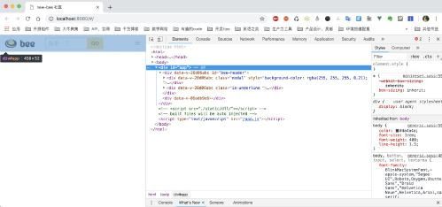
我们在主 APP 入口引入了头部布局, App.vue 是紧临 元素的正文元素,而这个程序所有页面、子路由全部都是 App.vue 入口的子集,说明全局引入布局会存在如下问题:
1、这个项目所有的项目都一定会带上 Header 组件渲染的内容 2、而且会影响在下期 《性能优化》中讲的 webpack 按需加载的性能。
当然可以再 Header 组件上书写逻辑条件,过滤指定的路由,但会破坏项目的易读性,难以维护
我个人是比较推荐第一种:按需引入的方式。
继续布局
- 照猫画虎写好 Footer
| vim new-bee/src/renderer/components/layout/Footer.vue | |
| <template><footer class="footer footer-light-medium " style="padding-bottom: 20px;padding-top: 20px;"><div class="container"><div class="columns"><!-- Column --><div class="column is-4"><div class="mb-20"> | |
| < img class="small-footer-logo" src="https://img.actd.tw/images/2018/11/17/bee.png" alt=""> | |
| <div class="footer-description pt-10"> | |
| new bee 是一个为开发者提供的专注于技术分享的开源社区,所有源码均可在 github 上找到,希望对广大开发者有所帮助。 | |
| </div></div><div><span class="moto">喜欢项目可以点赞支持 <a href="https://github.com/pkwenda/new-bee" target="_blank"><span class="icon"><i class="fa fa-github"></i></span> | |
| </a >.</span><div class="social-links mt-20"> | |
| </div></div></div><!-- Column --><div class="column is-6 is-offset-2"><div class="columns"><!-- Column --><div class="column"><ul class="footer-column"><li class="column-header"> | |
| Links | |
| </li><li class="column-item"><a href="https://github.com/pkwenda/new-bee">Home</a ></li><li class="column-item"><a href="https://cssninja.io/themes">Blog</a ></li><li class="column-item"><a href="https://github.com/pkwenda/new-bee/wiki">Wiki</a ></li></ul></div><!-- Column --><div class="column"><ul class="footer-column"><li class="column-header"> | |
| Ressources | |
| </li><li class="column-item"><a href="https://cssninja.io/help">Help center</a ></li><li class="column-item"><a href="https://cssninja.io/blog">Blog</a ></li><li class="column-item"><a href="https://cssninja.io/help/rules">Rules</a ></li></ul></div><!-- Column --><div class="column"><ul class="footer-column"><li class="column-header"> | |
| Terms | |
| </li><li class="column-item"><a href="https://cssninja.io/help/terms/licenses/personal">Personal</a ></li><li class="column-item"><a href="https://cssninja.io/help/terms/licenses/developer">Developer</a ></li><li class="column-item"><a href="https://cssninja.io/help/terms/service">Terms of Service</a ></li></ul></div></div></div></div></div> | |
| </footer> | |
| </template> | |
| <script> | |
| import _ from "lodash"; | |
| export default { | |
| name: "Footer", | |
| data() { | |
| return {}; | |
| }, | |
| created() {}, | |
| destroyed() {}, | |
| mounted() { | |
| this.auto(); | |
| }, | |
| methods: {} | |
| }; | |
| </script> | |
别忘了在 HelloWorld 引入一下
- 看看效果
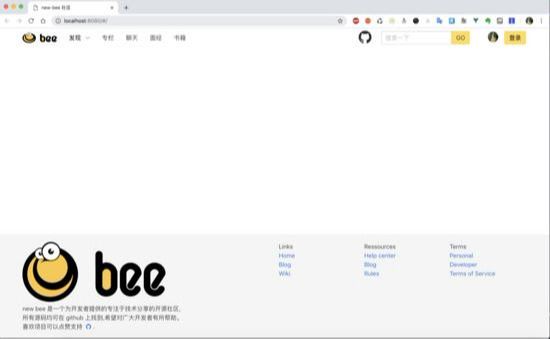
- 看起来效果还不错,接下来是 Content(正文)部分
| vim new-bee/src/renderer/components/layout/Content.vue | |
| <template><div class="container" style="height:700px"><h1 >博客列表</h1><article class="column is-3" v-for="blog in blogs" v-bind:key="blog"> | |
| <a class="bd-article-image is-bootstrap" ><span class="bd-article-overlay"></span><span class="bd-article-icon"><i class="fa fa-tag"></i></span><strong class="bd-star-icon" ><i class="fa fa-star"></i> <span style="font-size: 1rem"> {{blog.commendCount}}</span></strong><strong class="bd-article-info"><span><time class="bd-article-date" datetime="2017-10-09T00:00:00+00:00"> | |
| {{blog.tag}} | |
| </time><strong class="bd-article-title"> | |
| {{blog.title}} | |
| </strong></span></strong></a></article></div> | |
| </template> | |
| <script> | |
| import _ from "lodash"; | |
| let article = { tag: "java", title: "java", commendCount: 0 }; | |
| export default { | |
| name: "Footer", | |
| data() { | |
| return { | |
| blogs: [ | |
| article, | |
| article, | |
| article, | |
| article, | |
| article, | |
| article, | |
| article, | |
| article | |
| ] | |
| }; | |
| }, | |
| created() {}, | |
| destroyed() {}, | |
| mounted() {}, | |
| methods: {} | |
| }; | |
| </script> | |
| <style scoped> | |
| .bd-article-image.is-bootstrap { | |
| background-color: #6f5499; | |
| } | |
| .bd-article-image { | |
| background-color: #00d1b2; | |
| display: block; | |
| height: 240px; | |
| margin-left: auto; | |
| margin-right: auto; | |
| position: relative; | |
| text-align: center; | |
| } | |
| .bd-star-icon { | |
| font-size: 19.2px; | |
| font-size: 1.2rem; | |
| color: #0a0a0a; | |
| opacity: 0.25; | |
| bottom: 10px; | |
| left: 30px; | |
| position: absolute; | |
| -webkit-box-align: center; | |
| -ms-flex-align: center; | |
| -webkit-align-items: center; | |
| align-items: center; | |
| display: -webkit-box; | |
| display: -ms-flexbox; | |
| display: -webkit-flex; | |
| display: flex; | |
| -webkit-box-pack: center; | |
| -ms-flex-pack: center; | |
| -webkit-justify-content: center; | |
| justify-content: center; | |
| } | |
| .bd-article-icon, | |
| .bd-article-info { | |
| bottom: 0; | |
| left: 0; | |
| position: absolute; | |
| right: 0; | |
| top: 0; | |
| -webkit-box-align: center; | |
| -ms-flex-align: center; | |
| align-items: center; | |
| display: -webkit-box; | |
| display: -ms-flexbox; | |
| display: flex; | |
| -webkit-box-pack: center; | |
| -ms-flex-pack: center; | |
| justify-content: center; | |
| } | |
| .bd-article-info { | |
| padding: 20px; | |
| } | |
| a strong { | |
| color: currentColor; | |
| } | |
| .bd-article-date { | |
| color: rgba(0, 0, 0, 0.5); | |
| display: block; | |
| } | |
| .bd-article-title { | |
| color: white; | |
| display: block; | |
| font-size: 1.8rem; | |
| font-weight: 700; | |
| line-height: 1.25; | |
| padding: 0 20px; | |
| } | |
| .bd-article-icon { | |
| color: #0a0a0a; | |
| opacity: 0.25; | |
| } | |
| h1 { | |
| text-align: center; | |
| font-size: 30px; | |
| } | |
| .column.is-3, | |
| .column.is-3-tablet { | |
| -webkit-box-flex: 0; | |
| -ms-flex: none; | |
| flex: none; | |
| width: 25%; | |
| float: left; | |
| } | |
| </style> | |
- 看看效果
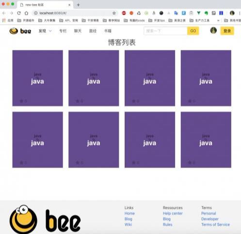
- HelloWorld.vue 代码看起来是这样的
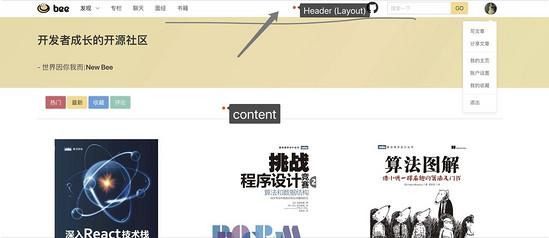
还算看得过去,我们继续参照图二
为 Content 制定 AD(广告) 组件。
| vim new-bee/src/renderer/components/common/AD.vue | |
| <template> | |
| <div class="ad"><h1>澳门皇家赌场上线啦</h1></div> | |
| </template> | |
| <script> | |
| import _ from "lodash"; | |
| export default { | |
| name: "AD", | |
| data() { | |
| return {}; | |
| }, | |
| destroyed() {}, | |
| mounted() {}, | |
| methods: {}, | |
| watch: {} | |
| }; | |
| </script><style scoped> | |
| .ad { | |
| width: 150px; | |
| height: 180px; | |
| background-color: #ececec; | |
| position: fixed; | |
| right: 30px; | |
| top: 80px; | |
| } | |
| </style> | |
- 别忘了在 Content.vue 引入一下
| ... | |
| <AD></AD> | |
| ... | |
| import AD from "@/components/common/AD"; | |
| export default { | |
| name: "Content", | |
| components: { AD }, | |
| ... | |
| } | |
- 看下效果
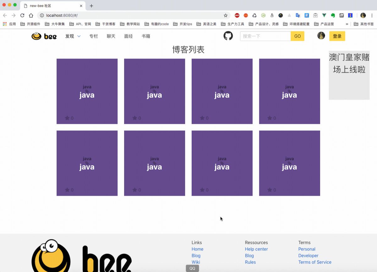
- 对比一下我们之前 sketch 画的草图

差不多完成了我们初步的构思
总结
至此页面布局和组件的引用大概讲述完了,相信大家可以举一反三,写好自己的小网站,其中更复杂的嵌套方式不再讲了,大家直接去看项目吧。
作者的话
其实这个项目老早就是今天这个样子了,只是一直在下班后写教程,耽误了进度,写教程也不是复制粘贴,首先要保障准确性,而不是删删改改草草了事,想写出好的教程只能换位思考,以小白的身份,从 CLI 、头到尾一行代码一行代码堆上去。相信写到现在一部分人对前端也有了一些新的认识,前端已经不是引入一个 JQuery.js、Vue.js 去写脚本的时代了 (Angular 已经有 IOC 了),作为一个后端,前端初步就带大家玩到这里了,Electron 以后大家直接去看项目吧,没什么好讲的,下一章会单独讲解一章终章《前端性能优化》大概涉及: webpack按需加载 、gZip、CDN、没钱买服务器如何调试小程序等 Tips ,本教程全栈方向的,下一步还有后端微服务、消息队列、docker、docker-compose/rancher 模拟集群、运维 等几个点,以后会加快进度的,尽量新年之前写完全部内容。