效果展示
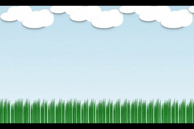
背景效果实现
效果展示

在这里插入图片描述
HTML结构
直接使用的body作为整个内容的大背景
| <body> | |
| </body> |
CSS样式
<body>元素具有一个从顶部到底部渐变的背景,并且这个渐变背景会在水平方向上循环移动,从而创建一个动态的效果。
| body { | |
| display: flex; | |
| justify-content: center; | |
| align-items: center; | |
| height: 100vh; | |
| background: linear-gradient(to bottom, #add8e6, #fff); | |
| background-size: 200% 200%; | |
| /* 创建一个比实际大的背景尺寸 */ | |
| animation: gradient 5s ease infinite; | |
| /* 动画效果 */ | |
| } | |
| /* 背景渐变动画 */ | |
| @keyframes gradient { | |
| 0% { | |
| background-position: 0% 50%; | |
| } | |
| 50% { | |
| background-position: 100% 50%; | |
| } | |
| 100% { | |
| background-position: 0% 50%; | |
| } | |
| } |
先将<body>元素设置为Flex容器,允许其内部元素使用Flexbox布局。在Flex容器的主轴(默认为水平方向)上居中对齐其子元素。
为<body>设置一个线性渐变背景。从顶部到底部,颜色从#add8e6(浅青色)渐变到#fff(白色)。设置背景图像的大小为容器大小的200%。因为背景是一个渐变,所以这实际上为渐变动画提供了更多的空间。最后添加一个CSS动画。动画的持续时间为5秒,使用ease缓动函数,并且无限次地重复。
云效果实现
效果展示

在这里插入图片描述
HTML结构
在HTML中定义云朵的容器。每个云朵都可以用一个<div>元素来表示,并通过添加不同的类名来区分它们。
| <div class="cloud cloud-1"></div> | |
| <div class="cloud cloud-2"></div> | |
| <div class="cloud cloud-3"></div> |
类名 (cloud-1, cloud-2, cloud-3) 为了区分不同的云朵并给它们不同的样式(如大小、位置和动画延迟),使用了不同的类名。这些类名可以与基础 cloud 类一起使用,以提供额外的样式信息。
CSS样式
接下来,我们使用CSS来定义云朵的样式和动画效果。
主要使用到的是以下四种:
- 基本样式: 设置云朵的颜色、形状、大小和透明度。
- 定位: 使用
position: absolute;将云朵定位在页面的任意位置。 - 动画: 定义
float动画,使云朵看起来像是在空中漂浮。 - 阴影: 为云朵添加一些阴影效果,使其看起来更加立体。
先给整体布局设置一下
| .cloudMain,.cloudMain-item { | |
| display: flex; | |
| } | |
| .cloud { | |
| position: relative; | |
| background: #fff; | |
| width: 200px; | |
| height: 60px; | |
| border-radius: 200px / 100px; | |
| /* 椭圆的水平半径和垂直半径 */ | |
| margin: 10px; | |
| } | |
| .cloud:before, | |
| .cloud:after { | |
| content: ''; | |
| position: absolute; | |
| background: #fff; | |
| width: 100px; | |
| height: 80px; | |
| border-radius: 100px / 80px; | |
| top: -40px; | |
| left: 50px; | |
| } | |
| .cloud:after { | |
| width: 120px; | |
| height: 120px; | |
| top: -50px; | |
| left: 100px; | |
| } | |
| /* 可选:添加一些阴影和动画效果 */ | |
| .cloud { | |
| box-shadow: 0 10px 20px rgba(0, 0, 0, 0), 0 6px 6px rgba(0, 0, 0, 0.23); | |
| animation: float 3s ease-in-out infinite; | |
| } | |
| @keyframes float { | |
| 0% { | |
| transform: translateY(0); | |
| } | |
| 50% { | |
| transform: translateY(-10px); | |
| } | |
| 100% { | |
| transform: translateY(0); | |
| } | |
| } | |
| .cloud-1 { | |
| width: 130px; | |
| height: 64px; | |
| top: 50%; | |
| /* left: 30%; */ | |
| animation-delay: -2s; | |
| /* 不同的云朵有不同的动画延迟 */ | |
| } | |
| .cloud-2 { | |
| width: 173px; | |
| height: 81px; | |
| top: 70%; | |
| /* left: 50%; */ | |
| animation-delay: -1s; | |
| } | |
| .cloud-3 { | |
| width: 118px; | |
| height: 56px; | |
| top: 10%; | |
| /* left: 70%; */ | |
| } | |
| /* 浮动动画 */ | |
| @keyframes float { | |
| 0% { | |
| transform: translateY(0); | |
| } | |
| 50% { | |
| transform: translateY(-20px); | |
| /* 上下浮动距离 */ | |
| } | |
| 100% { | |
| transform: translateY(0); | |
| } | |
| } |
背景颜色 (background): 设置云朵的颜色。在这里,我们使用了白色 #fff。边框圆角 (border-radius): 通过设置边框圆角为50%,我们创建了一个圆形的云朵形状。透明度 (opacity): 为了使云朵看起来更自然,我们降低了其不透明度到0.6,使其呈现半透明效果。定位 (position): 我们将云朵的 position 属性设置为 absolute,这样可以使用 top 和 left 属性来精确控制云朵在页面上的位置。动画 (animation): 为了使云朵看起来像是在漂浮,我们使用了CSS动画。animation 属性包含多个值,例如动画名称 (float)、动画持续时间 (5s)、动画速度曲线 (ease-in-out) 以及动画是否应该无限循环 (infinite)。阴影 (box-shadow): 为了增强云朵的立体感,我们添加了两个阴影效果。这通过 box-shadow 属性实现,该属性允许我们定义阴影的颜色、偏移量、模糊半径和扩展半径。动画定义 使用 @keyframes 规则来定义动画 float。这个规则描述了动画从开始到结束的状态变化。在这个例子中,动画开始时 (0%) 云朵没有移动,动画中间 (50%) 云朵向上移动了20像素,然后动画结束时 (100%) 云朵又回到了初始位置。
草效果实现
单颗小草
效果展示

在这里插入图片描述
HTML结构
在HTML中定义草的容器。每个草都可以用一个<div>元素来表示
<div class="grass"></div>
CSS样式
先画出一个长三角,使用 ::before和::after做出前后各不同大小的长度和颜色。
| .grass { | |
| position: relative; | |
| width: 5px; | |
| left: -10px; | |
| height: 200px; | |
| margin: 2px; | |
| transform: rotate(5deg); | |
| transform-origin: bottom left; | |
| border-radius: 50% 50% 0 0 / 60% 60% 40% 40%; | |
| background: rgb(16, 121, 16); | |
| animation: sway 4s ease-in-out infinite; | |
| } | |
| .grass::before, | |
| .grass::after { | |
| content: ""; | |
| position: absolute; | |
| bottom: 0; | |
| background: rgb(44, 155, 44); | |
| transform-origin: bottom left; | |
| border-radius: 50% 50% 0 0 / 60% 60% 40% 40%; | |
| box-shadow: 0 0 10px rgba(52, 170, 52, 0.5); | |
| } | |
| .grass::before { | |
| width: 100%; | |
| height: 70%; | |
| left: 0; | |
| transform: rotate(-10deg); | |
| animation: sway 8s ease-in-out infinite; | |
| } | |
| .grass::after { | |
| width: 70%; | |
| height: 80%; | |
| left: 15%; | |
| bottom: 10%; | |
| transform: rotate(10deg); | |
| background: rgb(31, 126, 31); | |
| animation: sway 12s ease-in-out infinite; | |
| } | |
组合小草
效果展示

HTML结构
使用不同草进行组合,有错落的感觉。
| <div class="grassMain-item"> | |
| <div class="grass"></div> | |
| <div class="grass"></div> | |
| <div class="grass"></div> | |
| <div class="grass"></div> | |
| </div> | |
| <div class="grassMain-item"> | |
| <div class="grass"></div> | |
| </div> | |
| <div class="grassMain-item"> | |
| <div class="grass"></div> | |
| <div class="grass"></div> | |
| </div> | |
| <div class="grassMain-item"> | |
| <div class="grass"></div> | |
| <div class="grass"></div> | |
| </div> | |
| <div class="grassMain-item"> | |
| <div class="grass"></div> | |
| <div class="grass"></div> | |
| <div class="grass"></div> | |
| </div> |
CSS样式
使用keyframes加transform的rotate控制小草摆动;用nth-child随机控制草组合,用transform的scale控制草坪的错落。
| @keyframes sway { | |
| 0% { | |
| transform: rotate(-3deg) translateY(0); | |
| } | |
| 50% { | |
| transform: rotate(3deg) translateY(-5px); | |
| } | |
| 100% { | |
| transform: rotate(-3deg) translateY(0); | |
| } | |
| } | |
| .grassMain-item:nth-child(2n+1) { | |
| transform: scale(1.1); | |
| margin: 0px 1px; | |
| } | |
| .grassMain-item:nth-child(2n) { | |
| transform: scale(0.9); | |
| margin: 0px 3px; | |
| } | |
| .grassMain-item:nth-child(2n+2) { | |
| transform: scale(1); | |
| margin: 0px 2px; | |
| } | |
| .grassMain-item:nth-child(3n+2) { | |
| transform: scale(0.8); | |
| margin: 2px 0px; | |
| } | |
| .grassMain-item:nth-child(2n+2) .grass::after { | |
| width: 120%; | |
| } | |
| .grassMain-item:nth-child(2n+3) .grass::before { | |
| width: 140%; | |
| } |
完整代码
地址:https://download.csdn.net/download/weixin_48998573/89298548